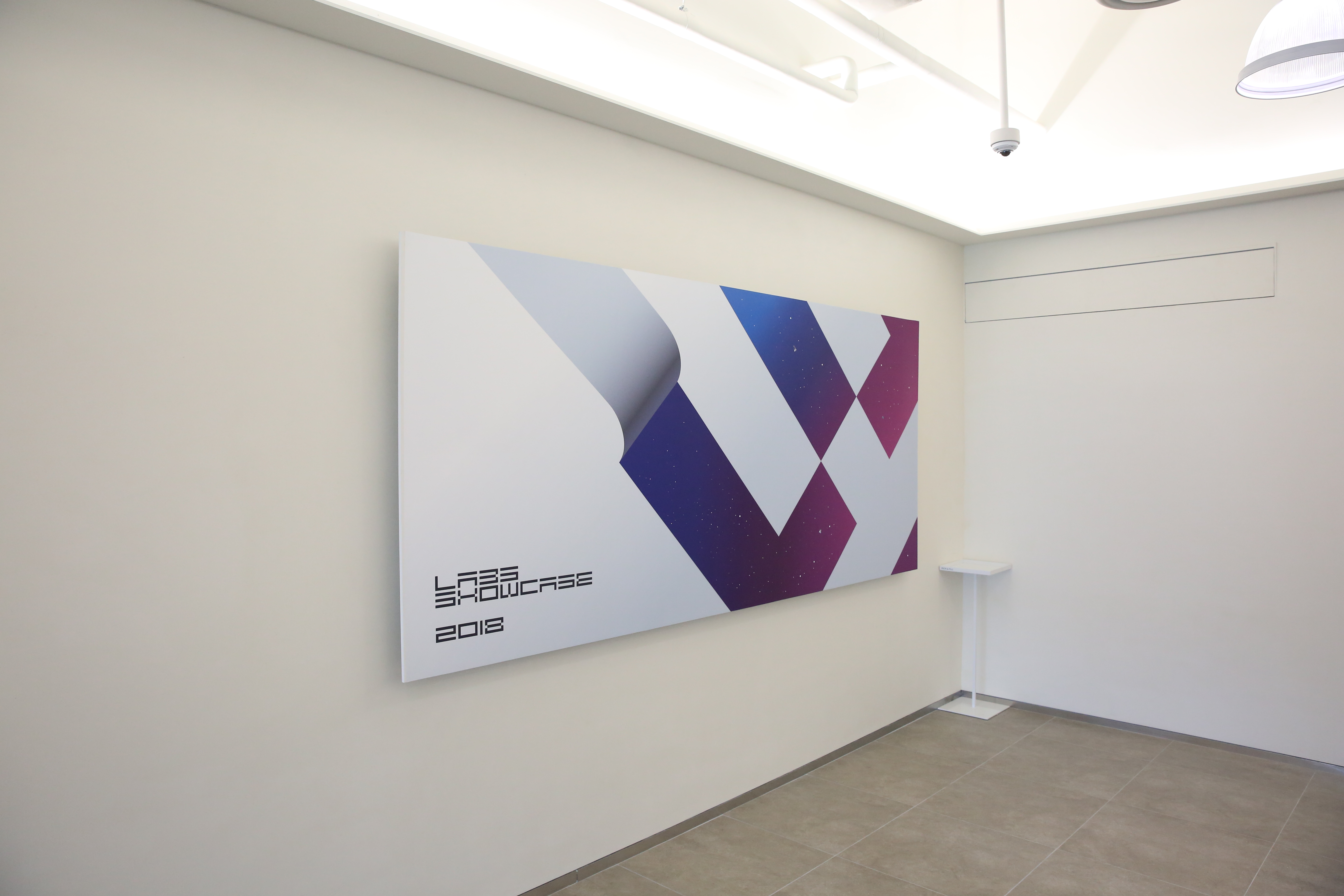
Naver Labs
Branding, identity design,
Brand experience design
2017-2019
Credit
Naver Labs BX Team
Naver Labs, an R&D subsidiary of NAVER (the largest search engine in South Korea), spun off from its mother brand to become a subsidiary in January 2017.
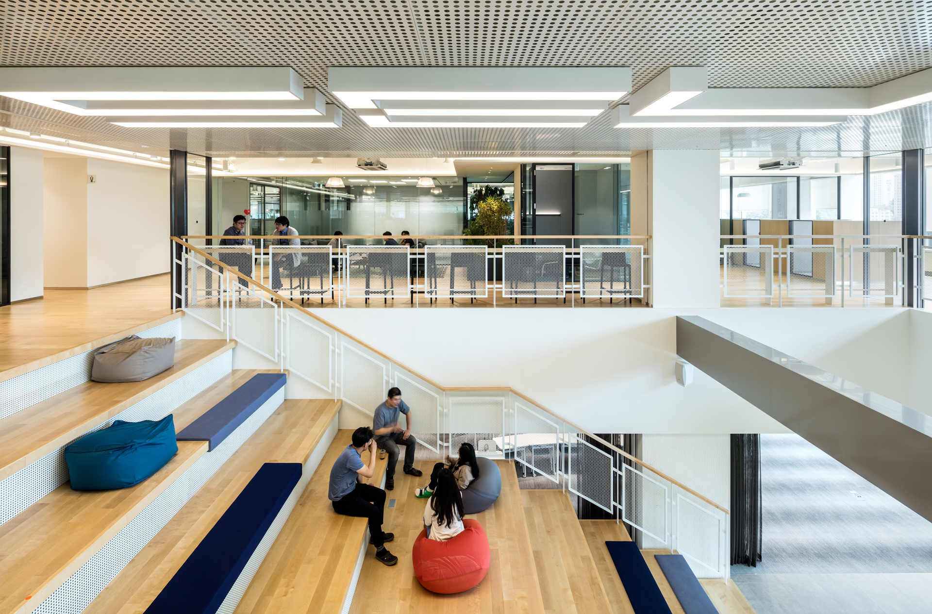
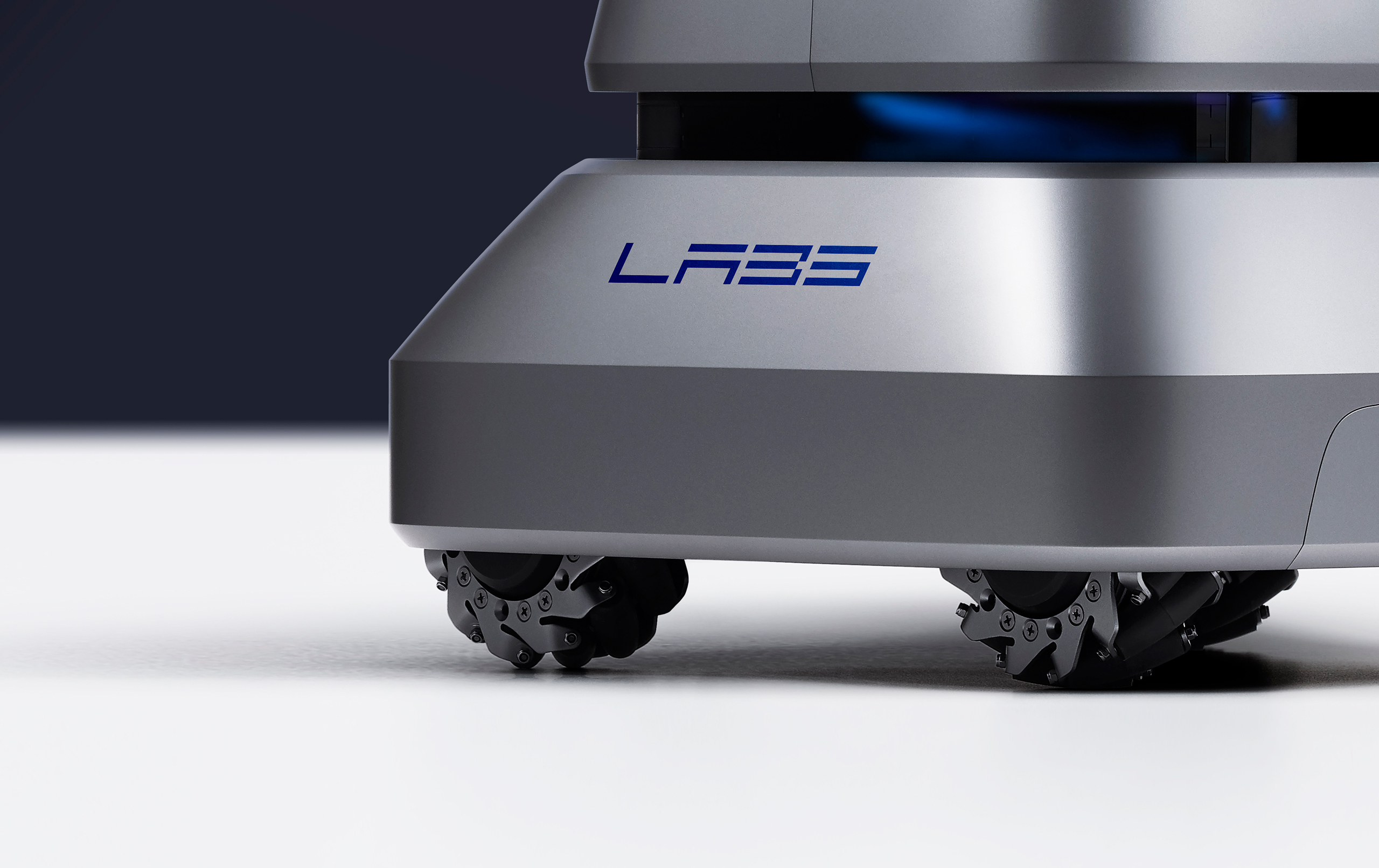
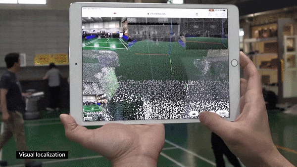
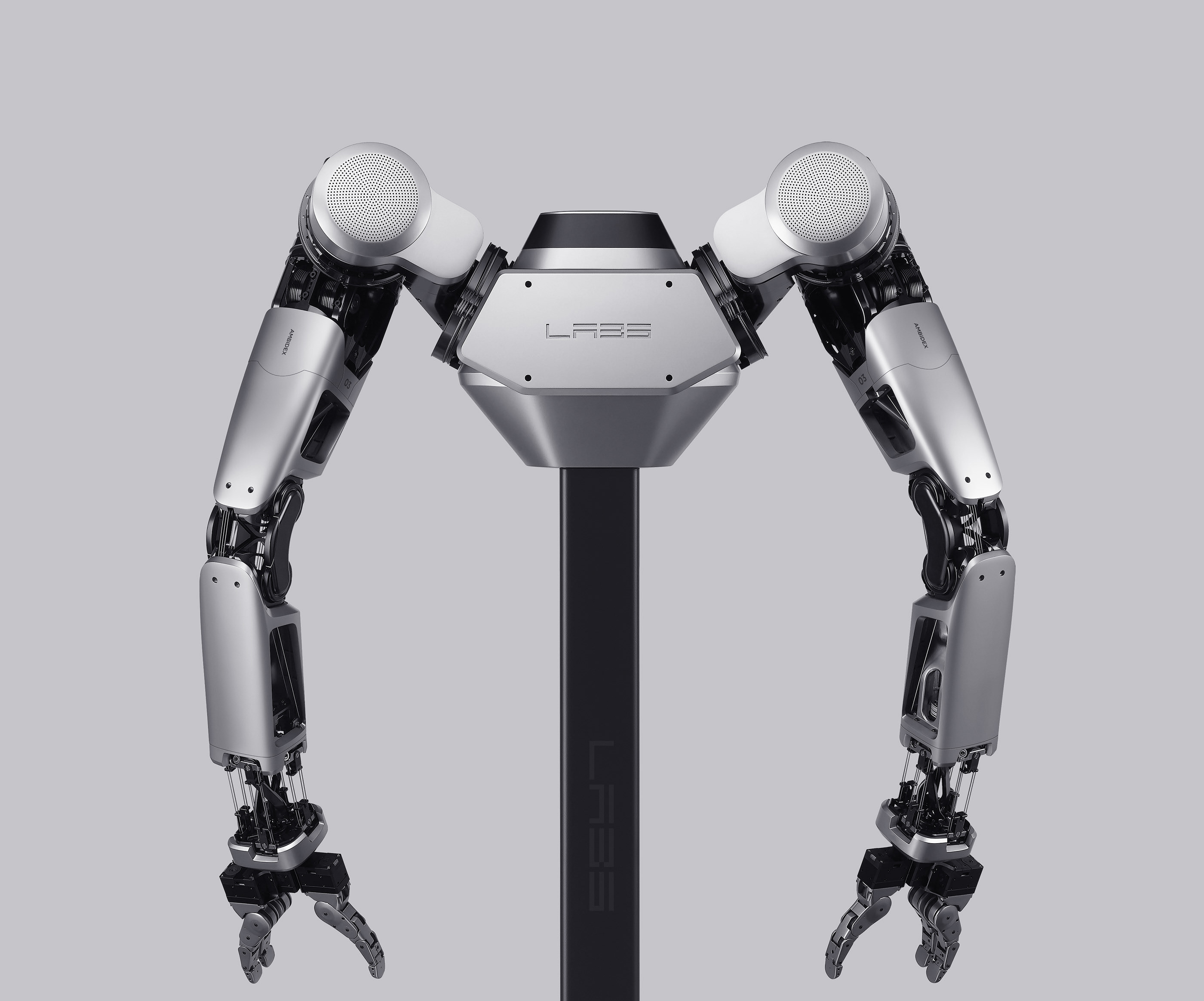
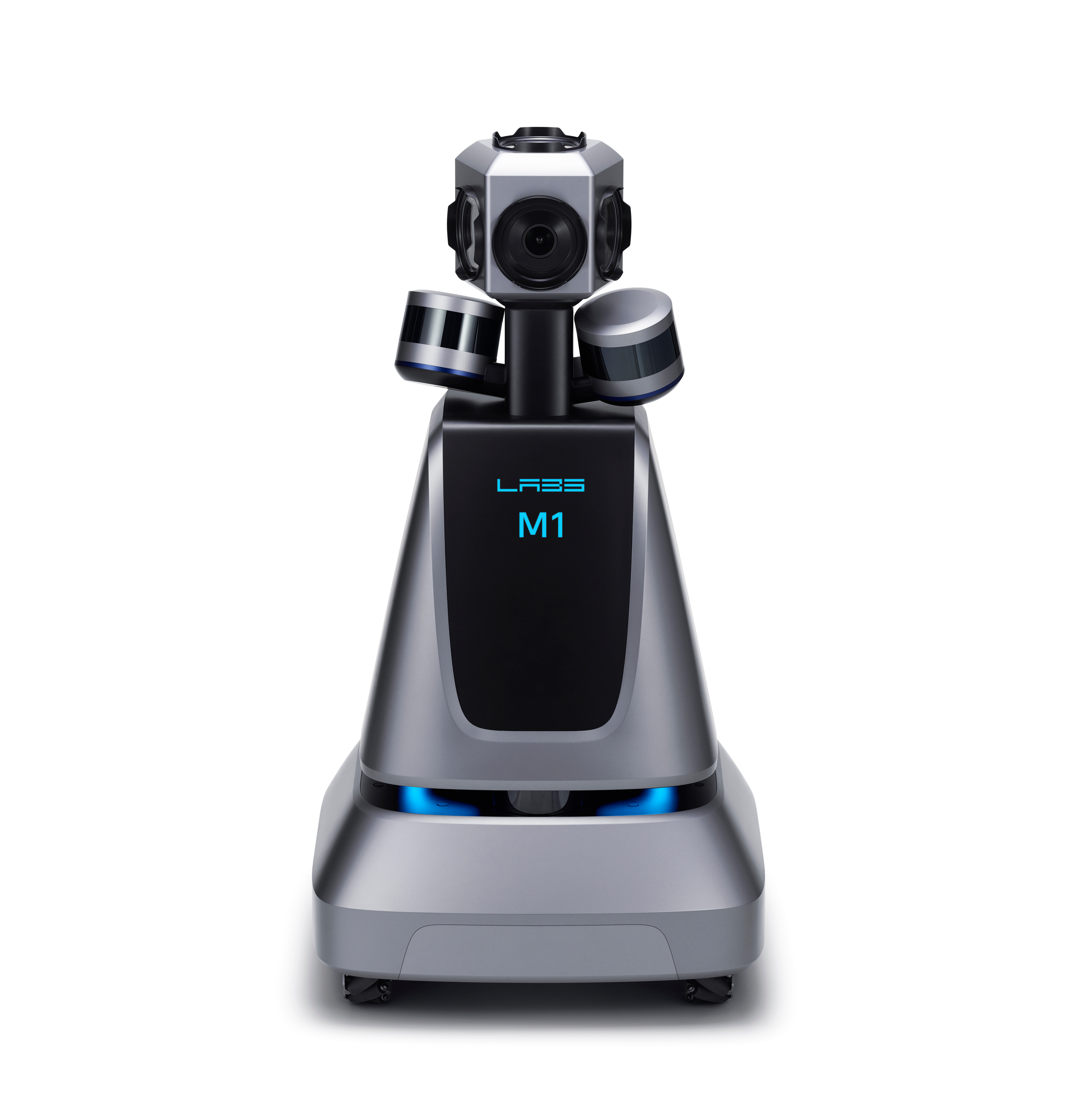
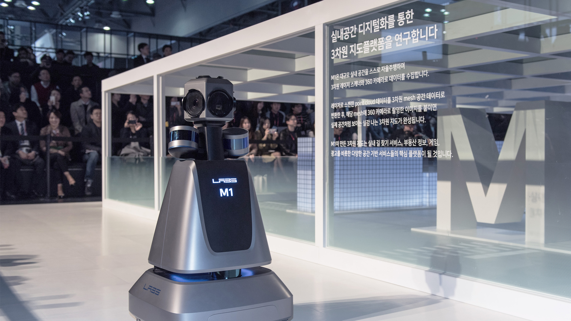
Naver Labs develop future technology: Ambient Intelligence in AI, robotics, autonomous driving, 3D/HD mapping, and AR, they try to connect machines, spaces, and information Ambient Intelligence establishes on location and mobility by accumulating high precision data from real space to connect people, information, and machines. Naver Labs also produce actual products such as robots, smartwatches, AmI speakers, and even AmI based apps.
Naver Labs develop future technology: Ambient Intelligence in AI, robotics, autonomous driving, 3D/HD mapping, and AR, they try to connect machines, spaces, and information Ambient Intelligence establishes on location and mobility by accumulating high precision data from real space to connect people, information, and machines. Naver Labs also produce actual products such as robots, smartwatches, AmI speakers, and even AmI based apps.


Strategic brand direction
I worked closely with the Naver Labs CEO and leaderships to clearly define who we are and what we do. From the interview with them, I was able to understand not only technology roadmap which enables what we tried to achieve but whom we want to work with.
There were two important requests from the CEO to refresh the brand.
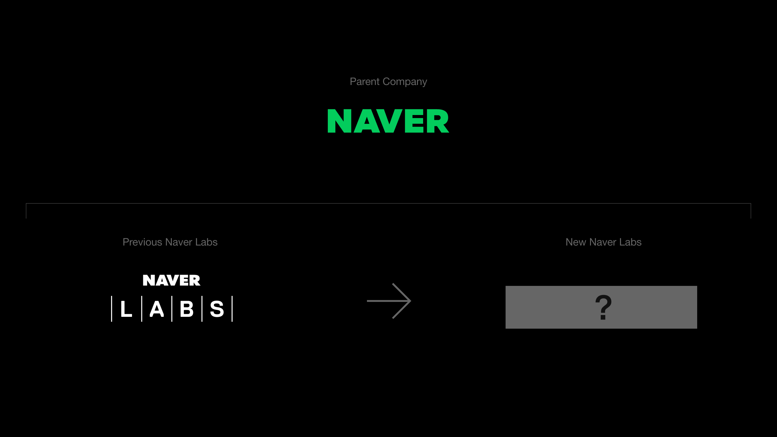
1. Independent Identity from its mother brand
We must be more than Naver’s ‘labs’. Let’s be the ‘Labs’.
The new Labs should have totally different brand image from the parent company, Naver. We are a pioneer discover new pathway that has never been explored before by the parent company or its subsidiaries).
2. A total stranger
What we do now has to be strange as the technology did not exist before. We have to get our audience’s attention and meet their expectations by being a perfect stranger.
I worked closely with the Naver Labs CEO and leaderships to clearly define who we are and what we do. From the interview with them, I was able to understand not only technology roadmap which enables what we tried to achieve but whom we want to work with.
There were two important requests from the CEO to refresh the brand.
1. Independent Identity from its mother brand
We must be more than Naver’s ‘labs’. Let’s be the ‘Labs’.
The new Labs should have totally different brand image from the parent company, Naver. We are a pioneer discover new pathway that has never been explored before by the parent company or its subsidiaries).
2. A total stranger
What we do now has to be strange as the technology did not exist before. We have to get our audience’s attention and meet their expectations by being a perfect stranger.

Brand Strategy
Brand Vision and mission
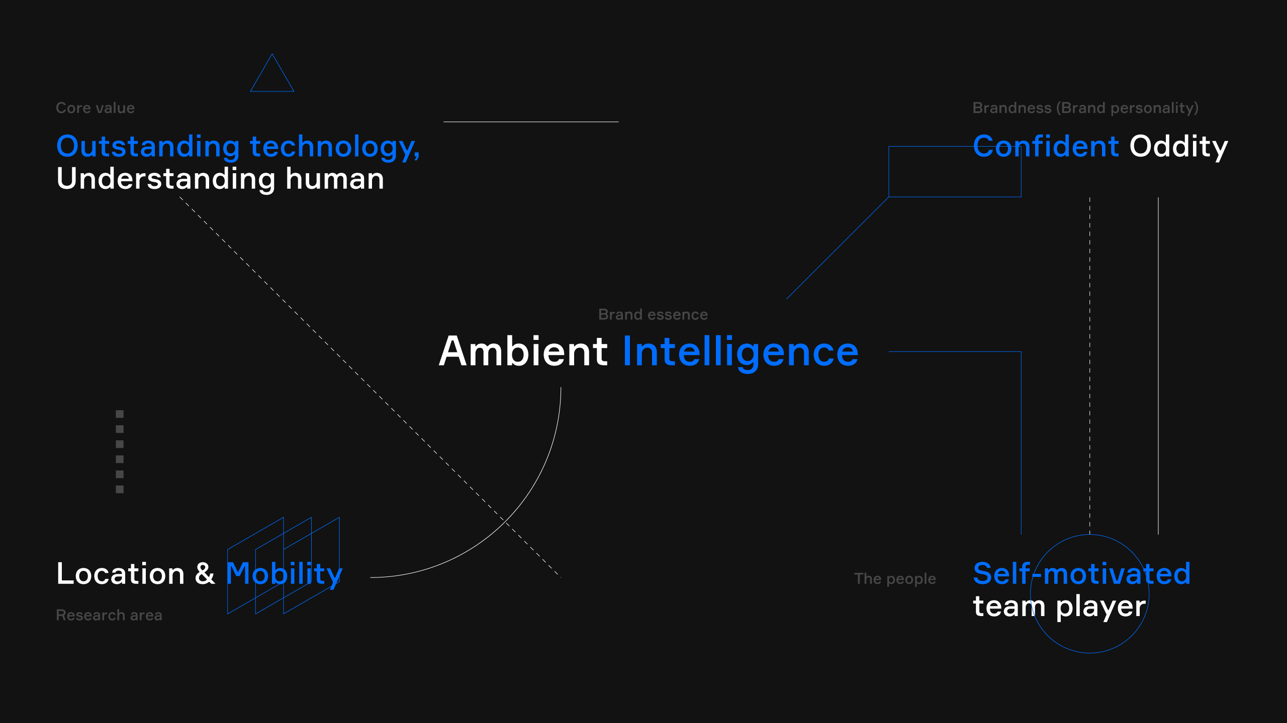
Naver Labs’ vision is to develop Ambient Intelligence(AmI) technologies. Naver Labs aims to provide solutions that can be seamlessly integrated into our life by focusing on gaining an understanding of location where people carry ou their lives, and intellectualising mobility that connects different spaces.
Brandness
Defining ourselves was the first step to build our brand. We defined our brandness as 'Confident Oddity'. From outside, we might look weird and odd enough as what we do does no existed before. We have to be a pioneer with a strong belief and confidence in our technology. 'Confident Oddity' is our brand ness and mindset to make a decision for everything: project, business, and even design.
The people
The people working for Naver Labs are self-motivated team players, willing to take a step further into an unknown area.
key fundamental concept Visualisation
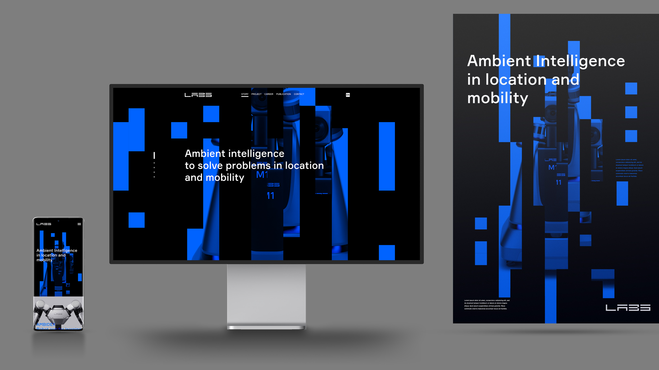
The new brand identity was built on our brand strategy that focuses on enabling Ambient Intelligence in location and mobility.
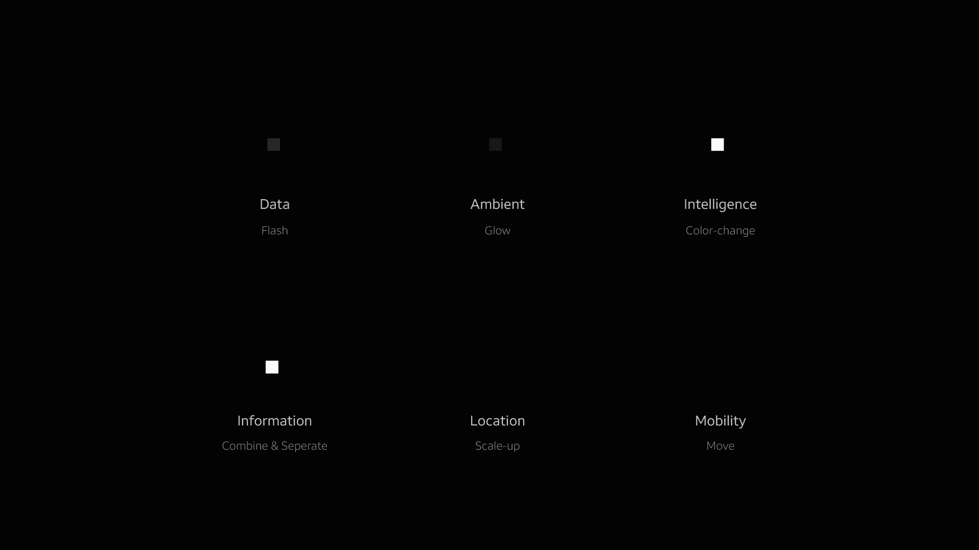
To have a good understanding of the concept of Ambient Intelligence, I explored more about it by dividing into fundamental aspects of it including ambient and intelligence, location and mobility, data and information, human and machines.
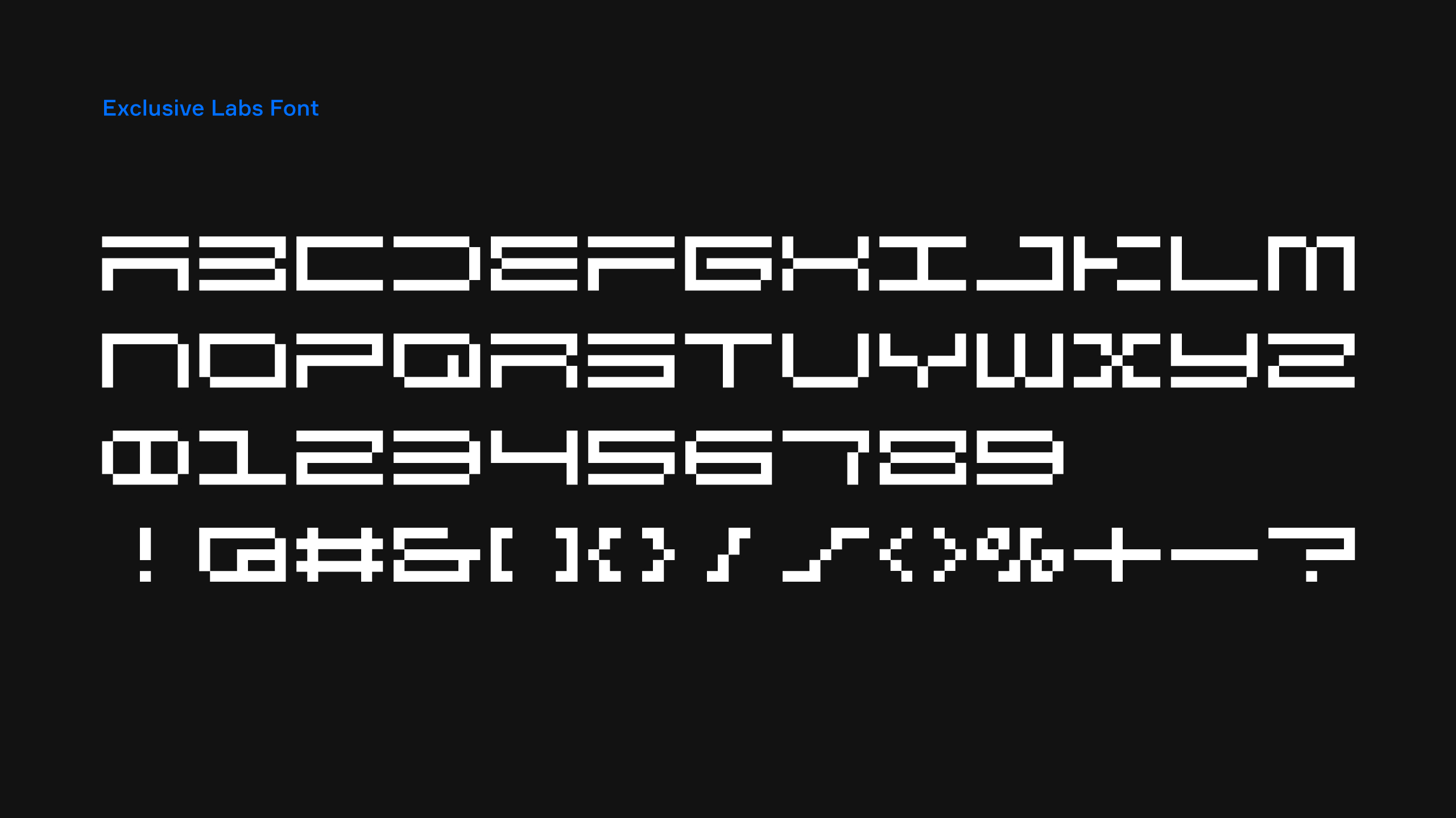
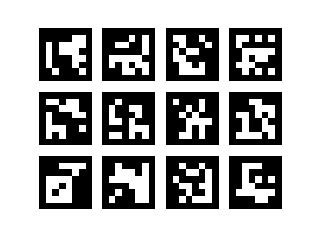
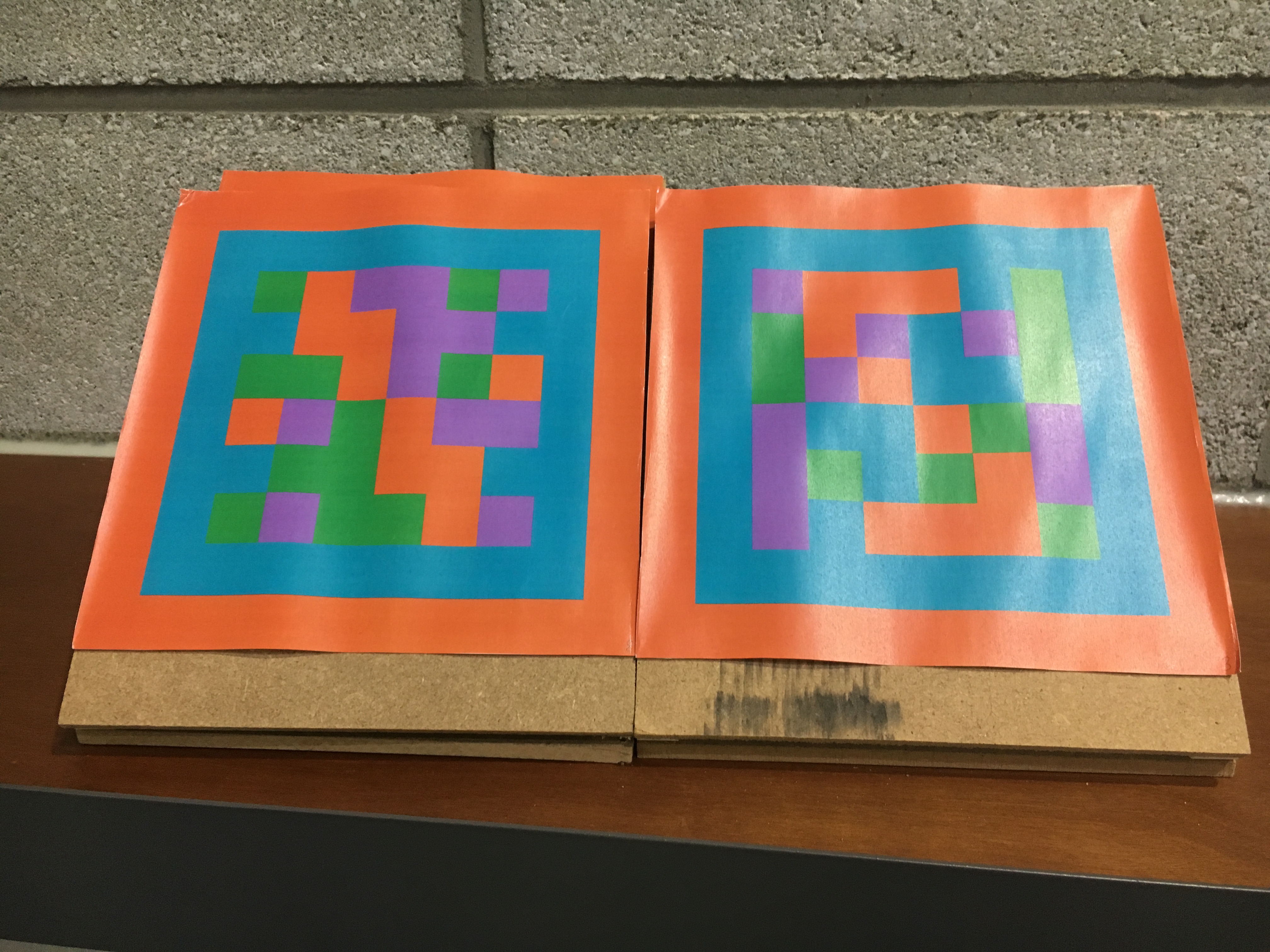
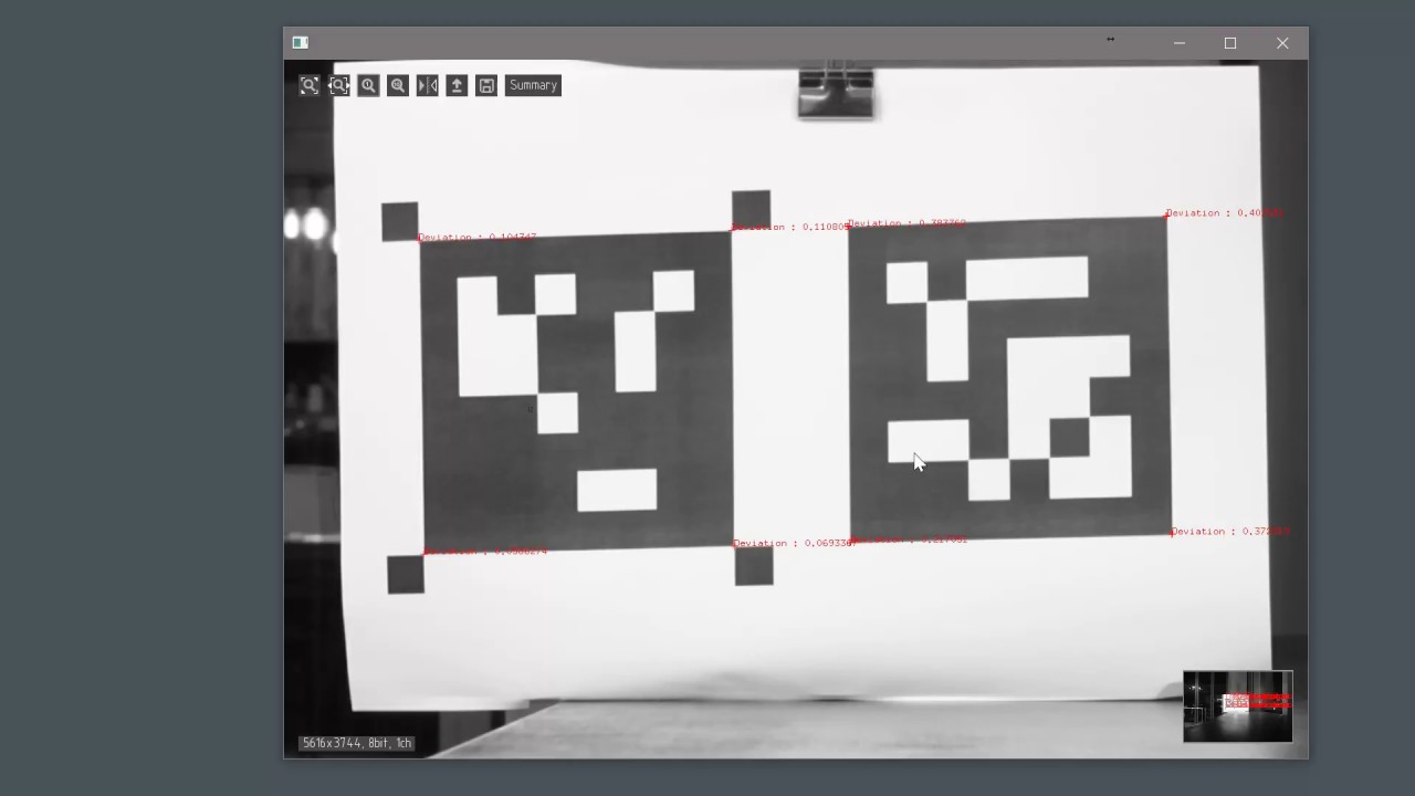
A simple square, inspired by the square mark used in Naver Labs' 3D mapping technology and AR-tag with which robots can scan the code to follow an order, was used as a fundamental graphic element to visualise key features. This square mark becomes dot and dash, appearing, and connecting to represent location and mobility in AmI to consist of the new logo.
Key elements in motion
Those are the key elements subtracted from Naver Labs’ research area. We explored to get those ideas visually explained.

1. localisation
Knowing the precise location of objects, people, and stores.

2. Routing
Based on the detected location on the 3D map,
the object or person can find its path to the destination

3. 3D mapping
3D mapping based on scanned image data to have more precise location data of objects, people and stores.
q
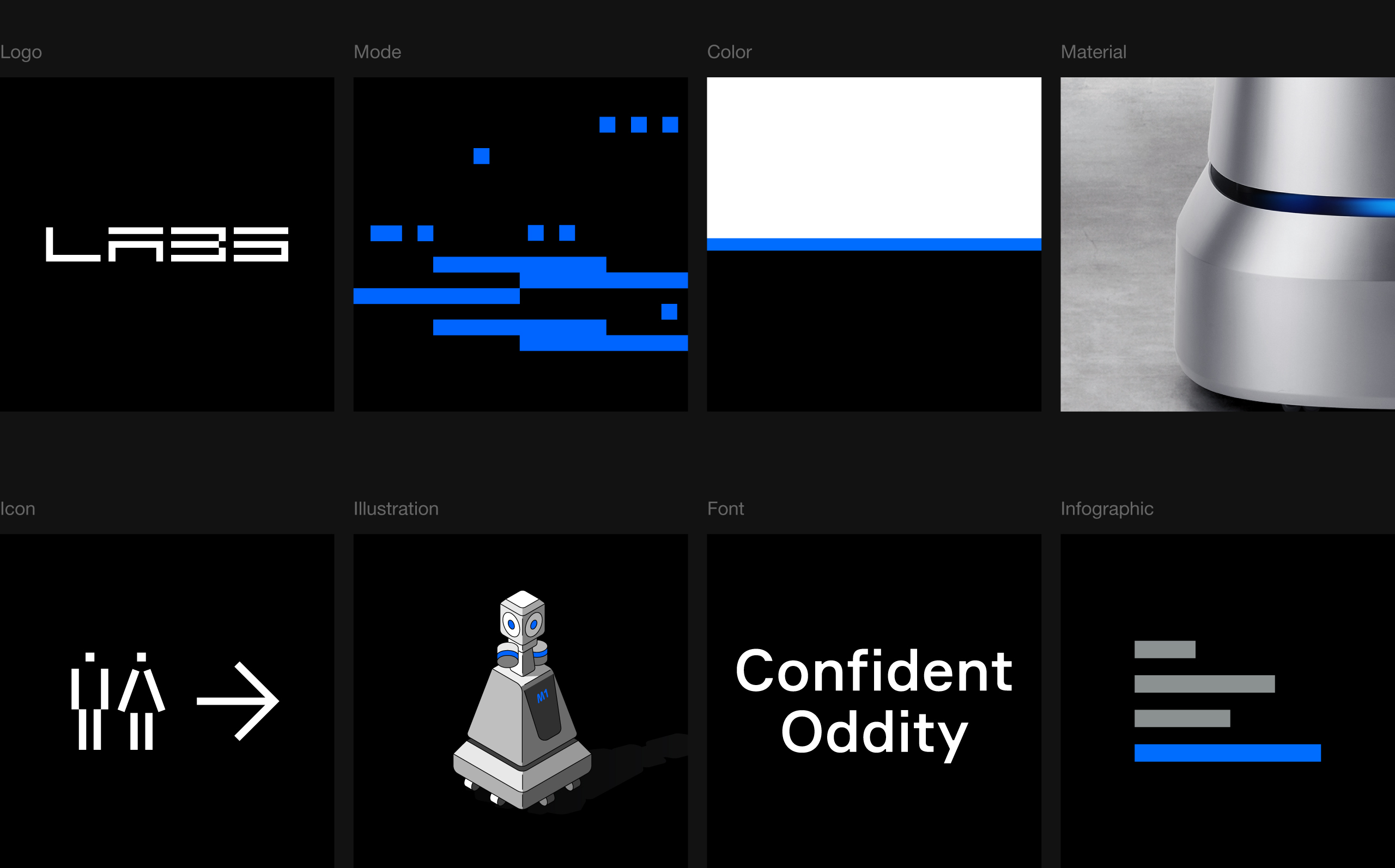
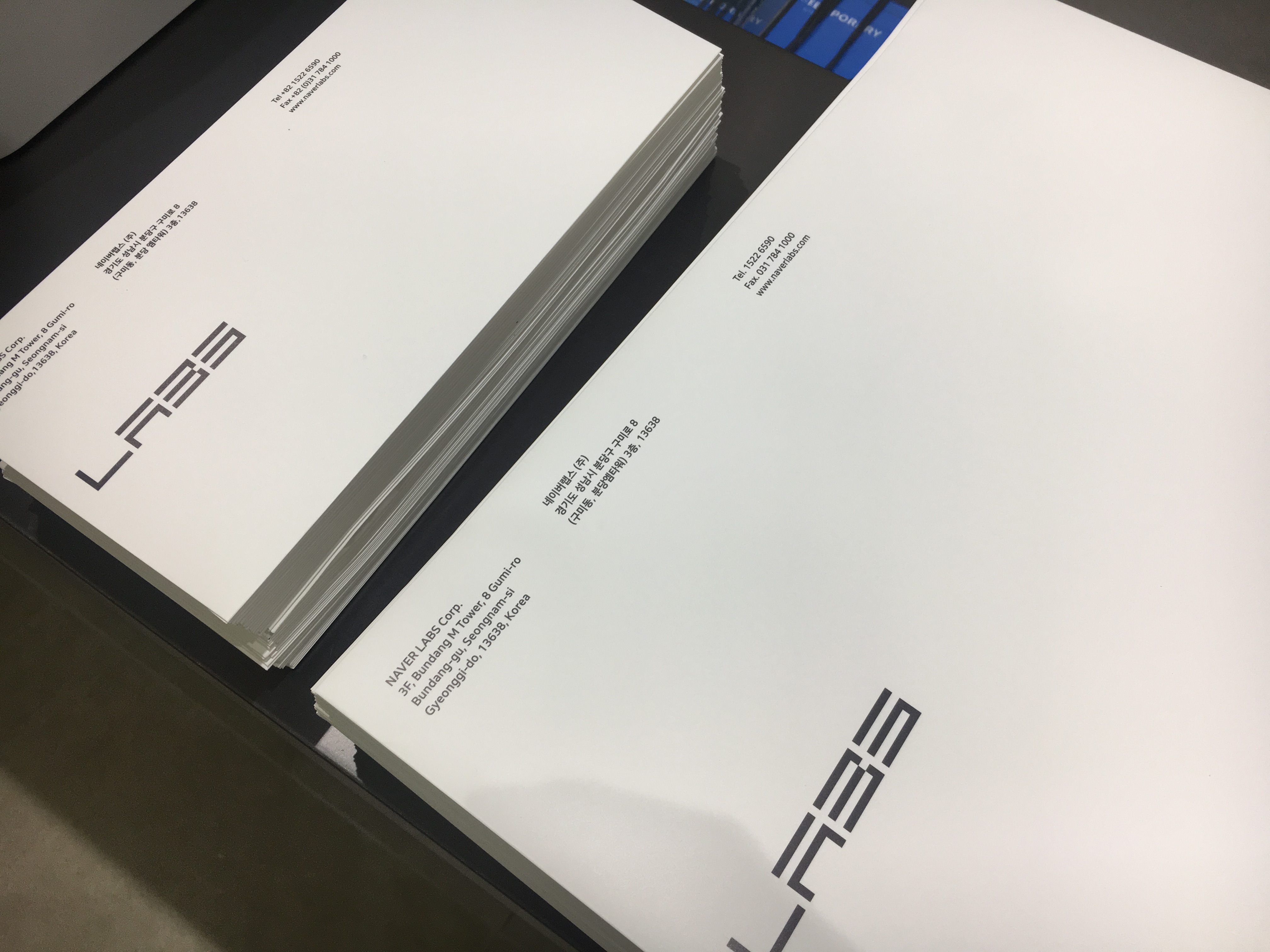
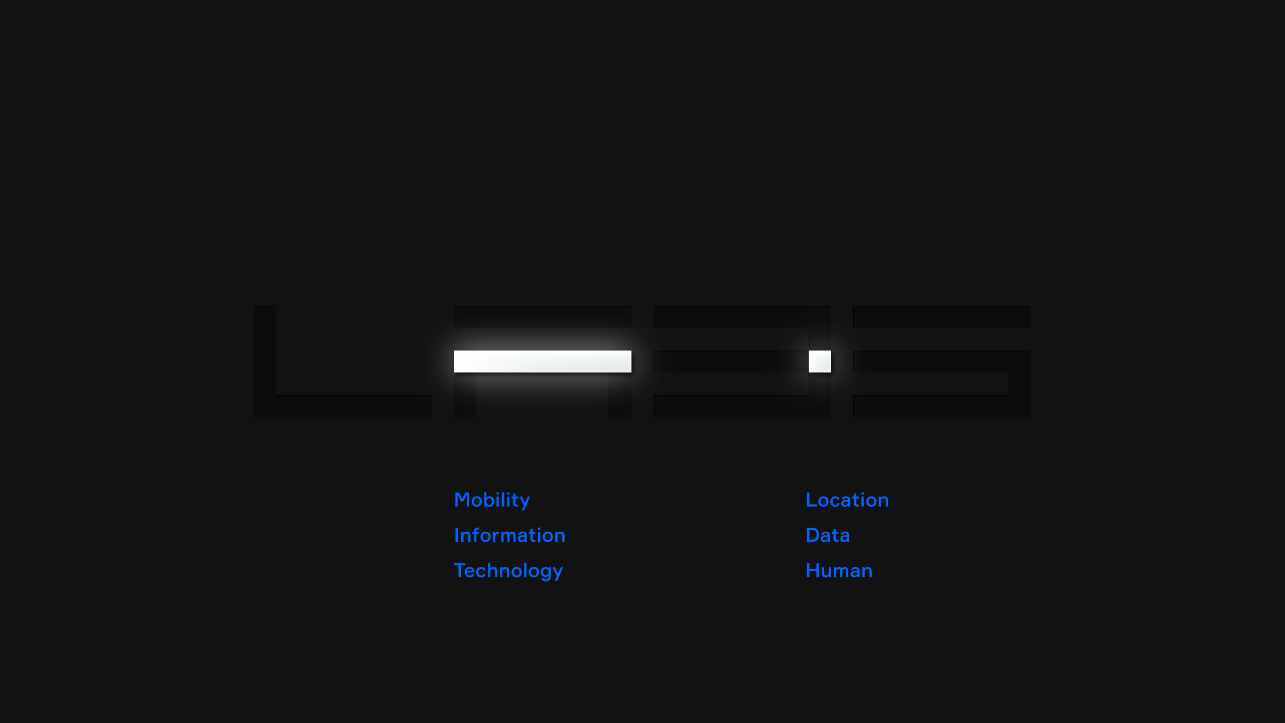
The Logo
The new logo gives Naver Labs its own distinctive dashes, making the logo an unusual type of letter or a glyph of AmI.
The winkling 4 squares that show an intellectual data calculating and collecting process move around illustrating its pathway to complete the logo. The logo contains the most important brand messages: Ambient intelligence in location and mobility.
The winkling 4 squares that show an intellectual data calculating and collecting process move around illustrating its pathway to complete the logo. The logo contains the most important brand messages: Ambient intelligence in location and mobility.


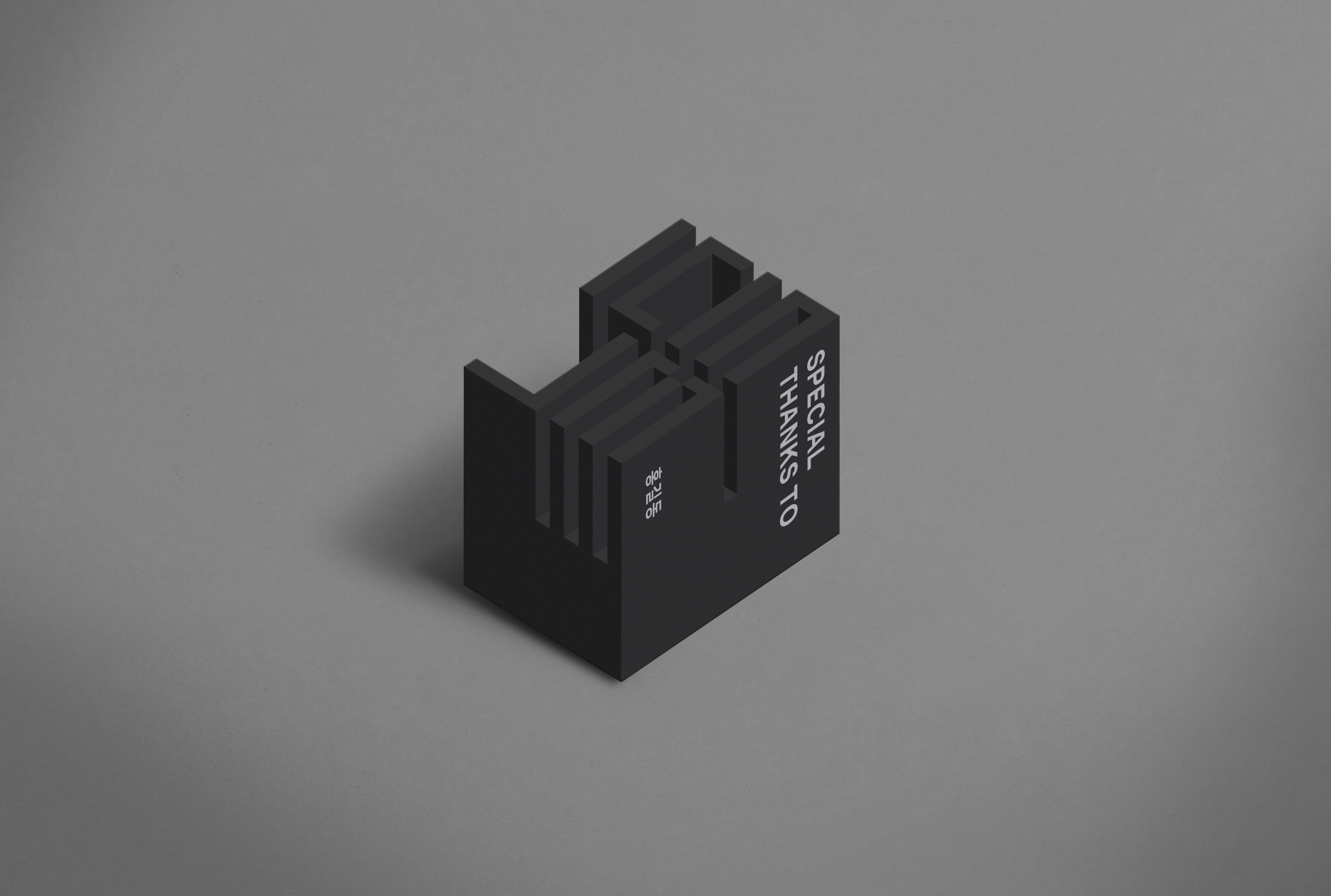
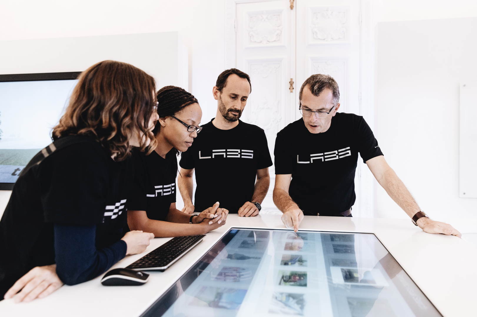
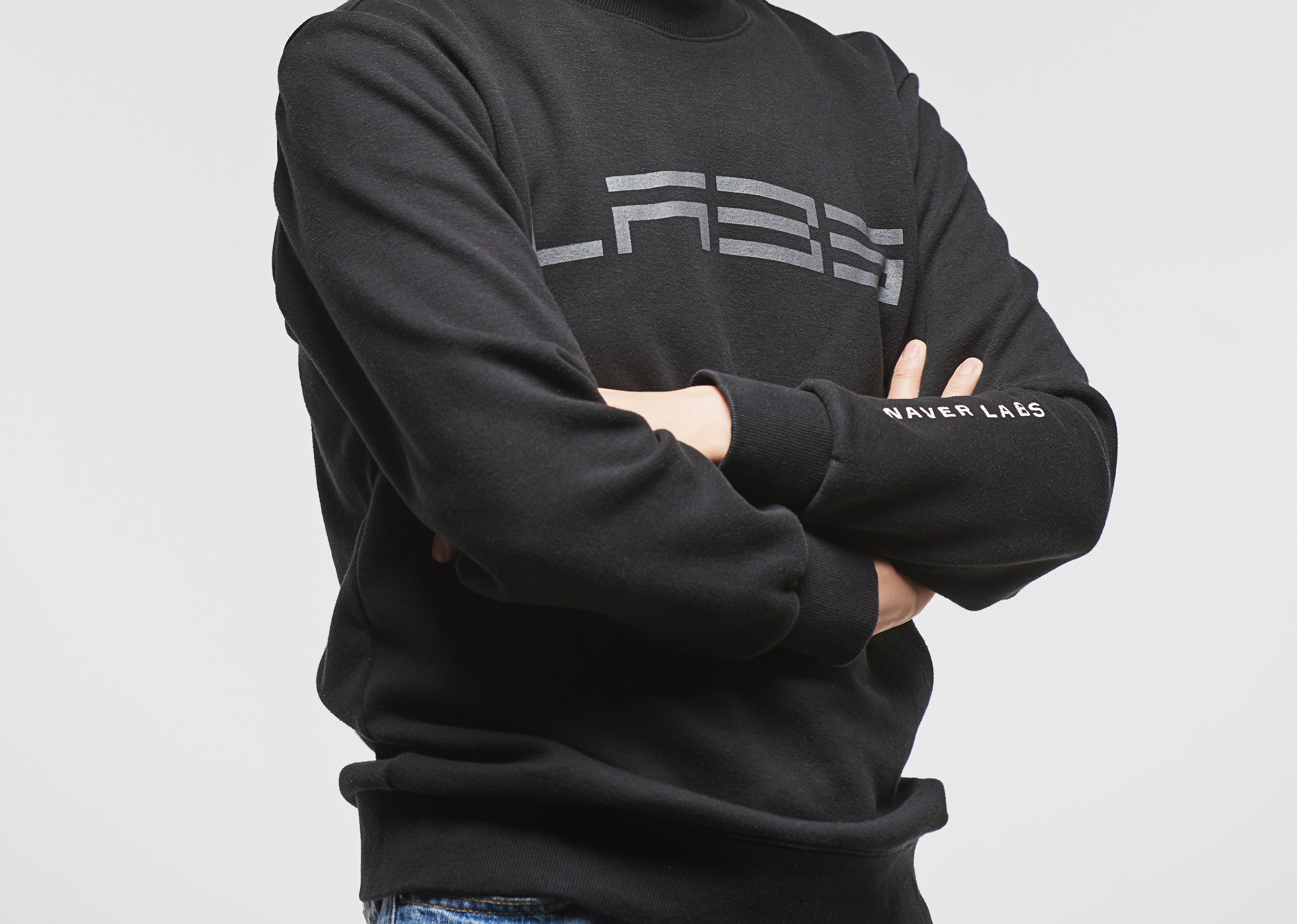
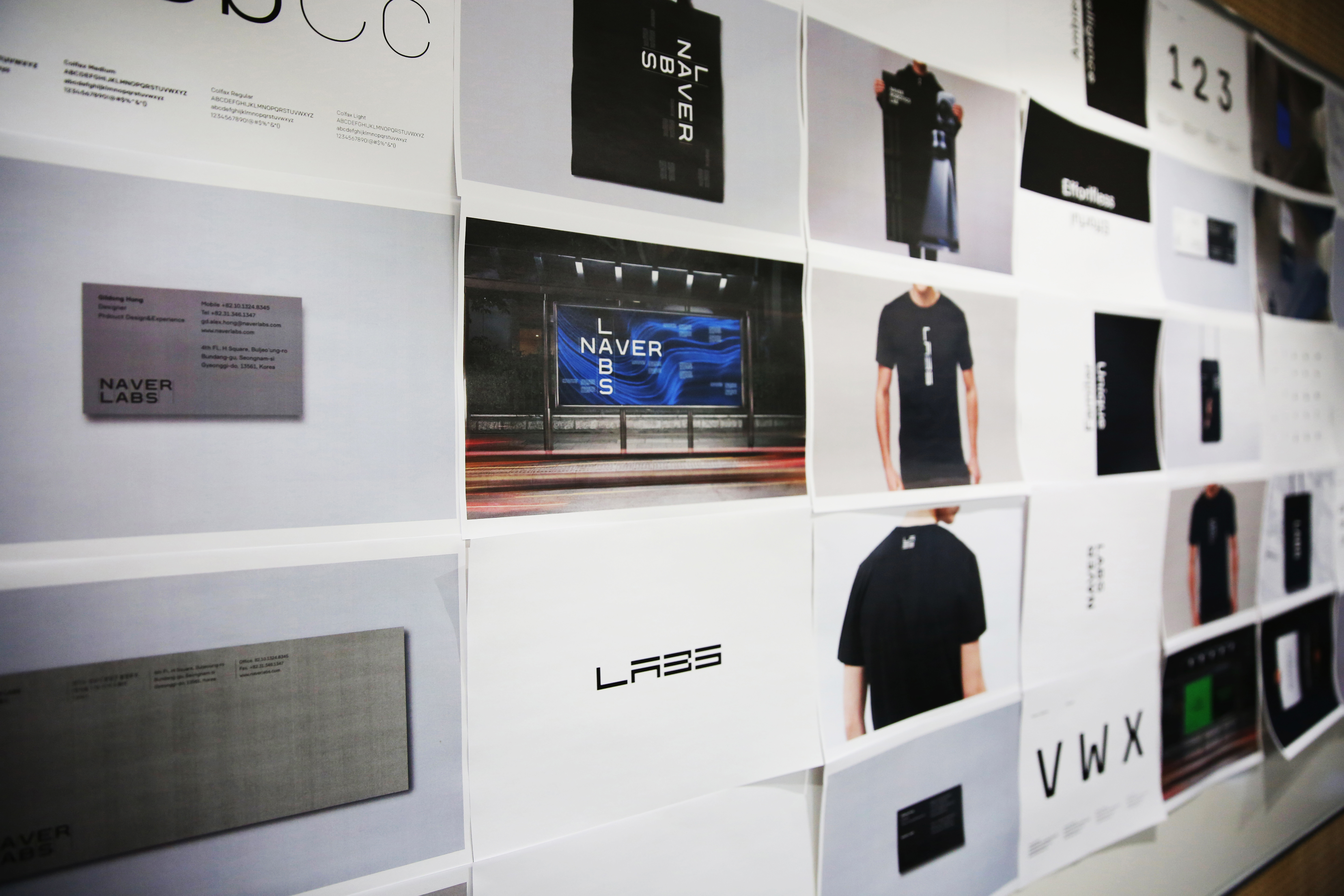
The Assets
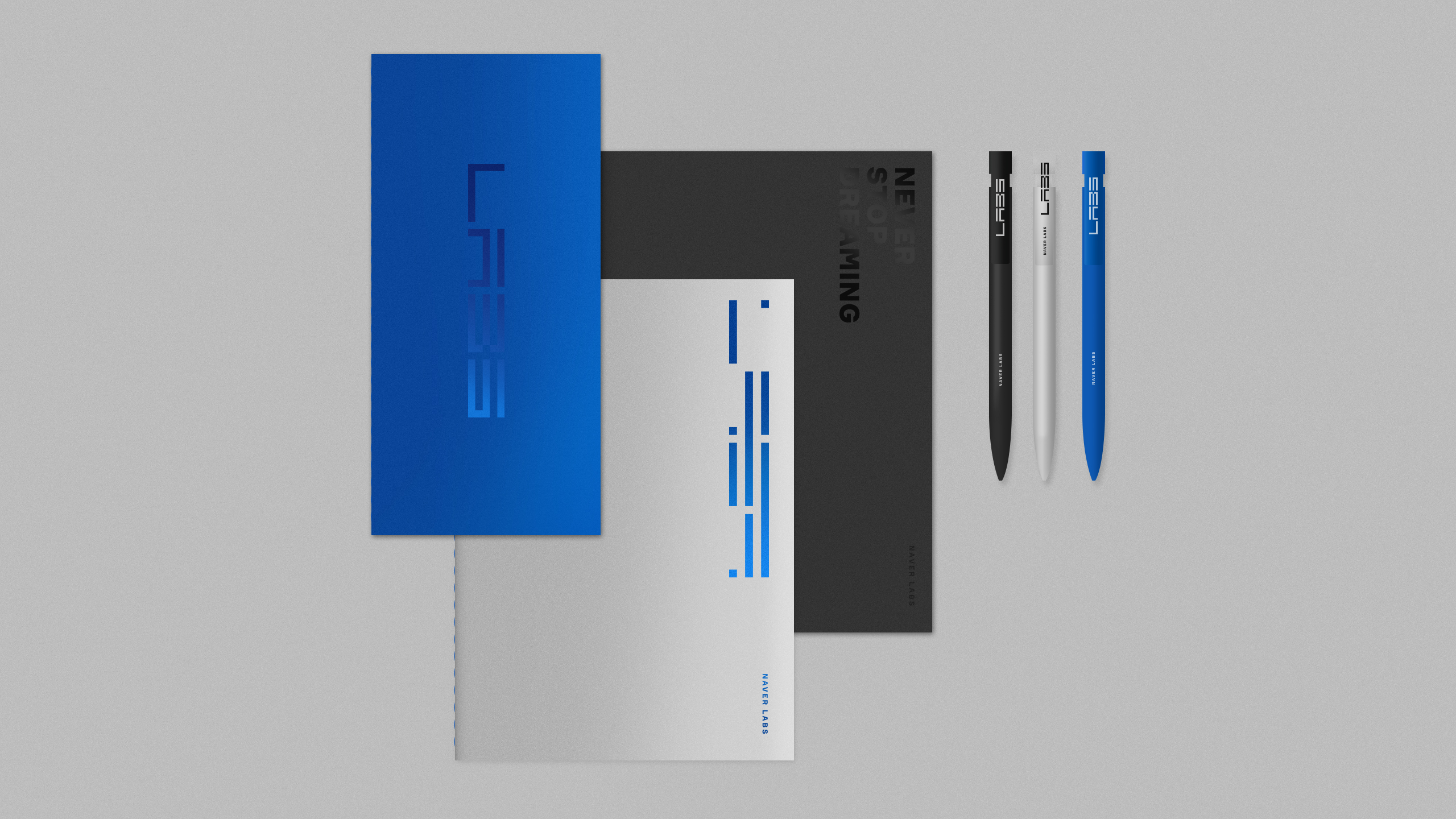
The design assets including: logo, typography, color, iconography, and so on are carefully set to build cohesive brand identity.
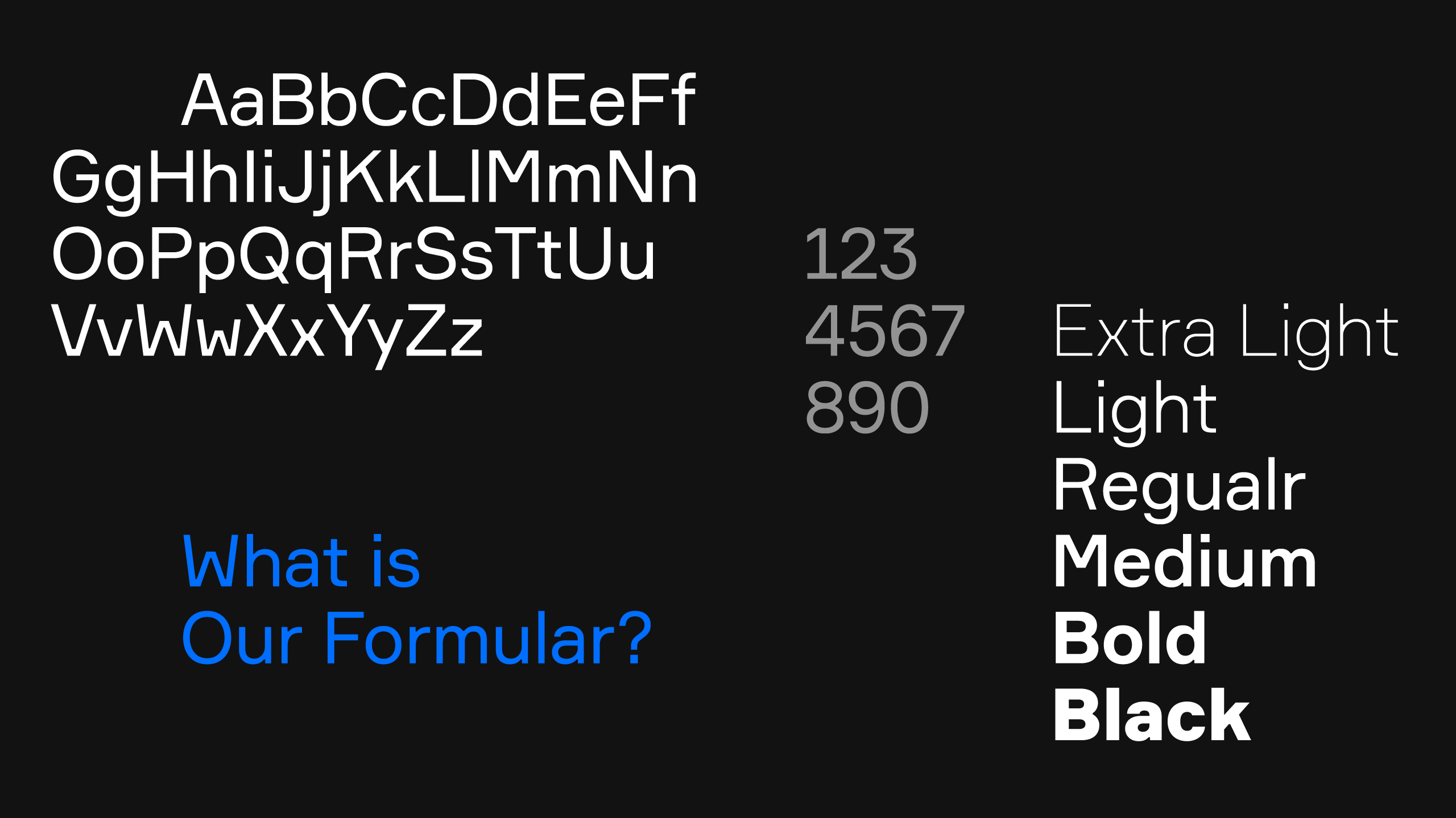
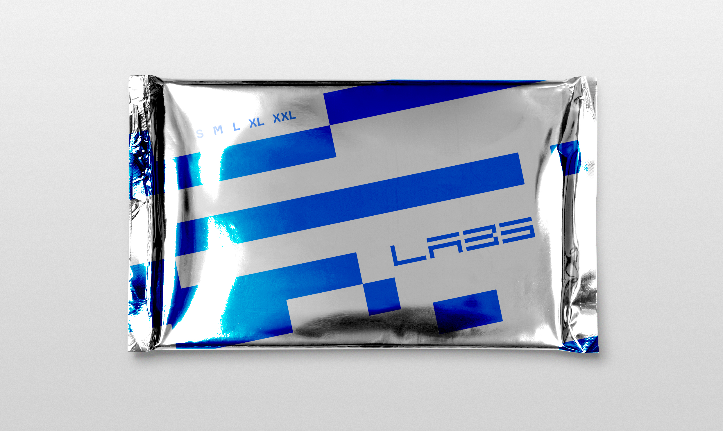
Formula play an important typographic role in all communications. The rigid geometric qualities and ink-trap character of this typeface establish the sense of location and mobility of the brand's visual identity.
The set of icons were designed with simple squares and dashes, aligned with the design language of the brand.
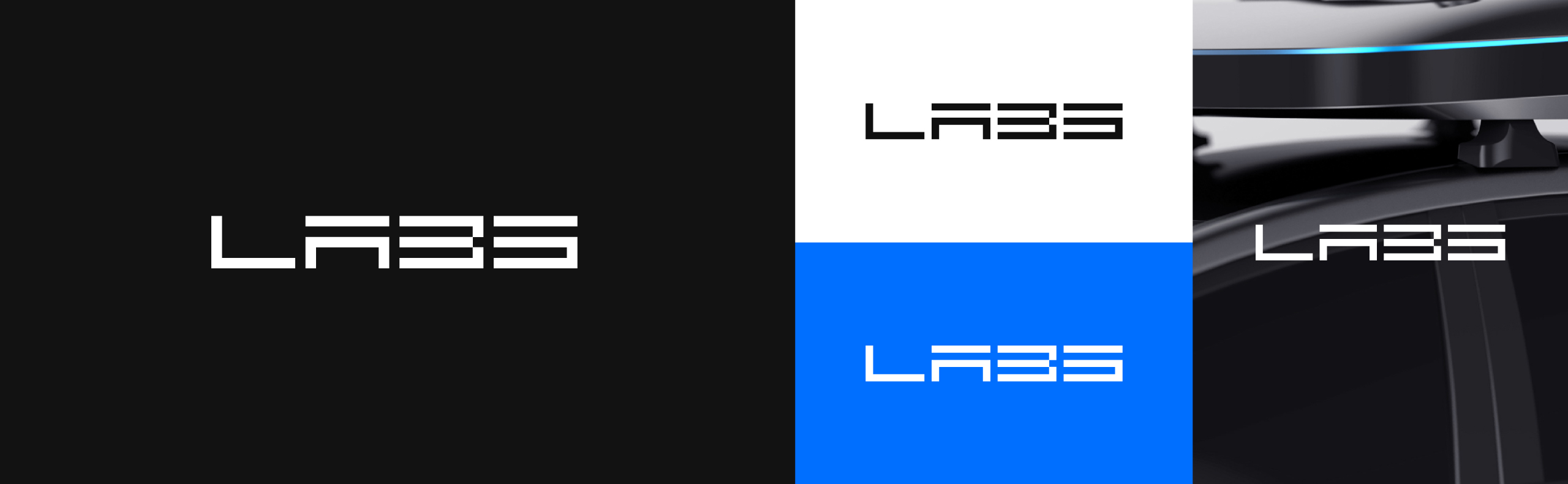
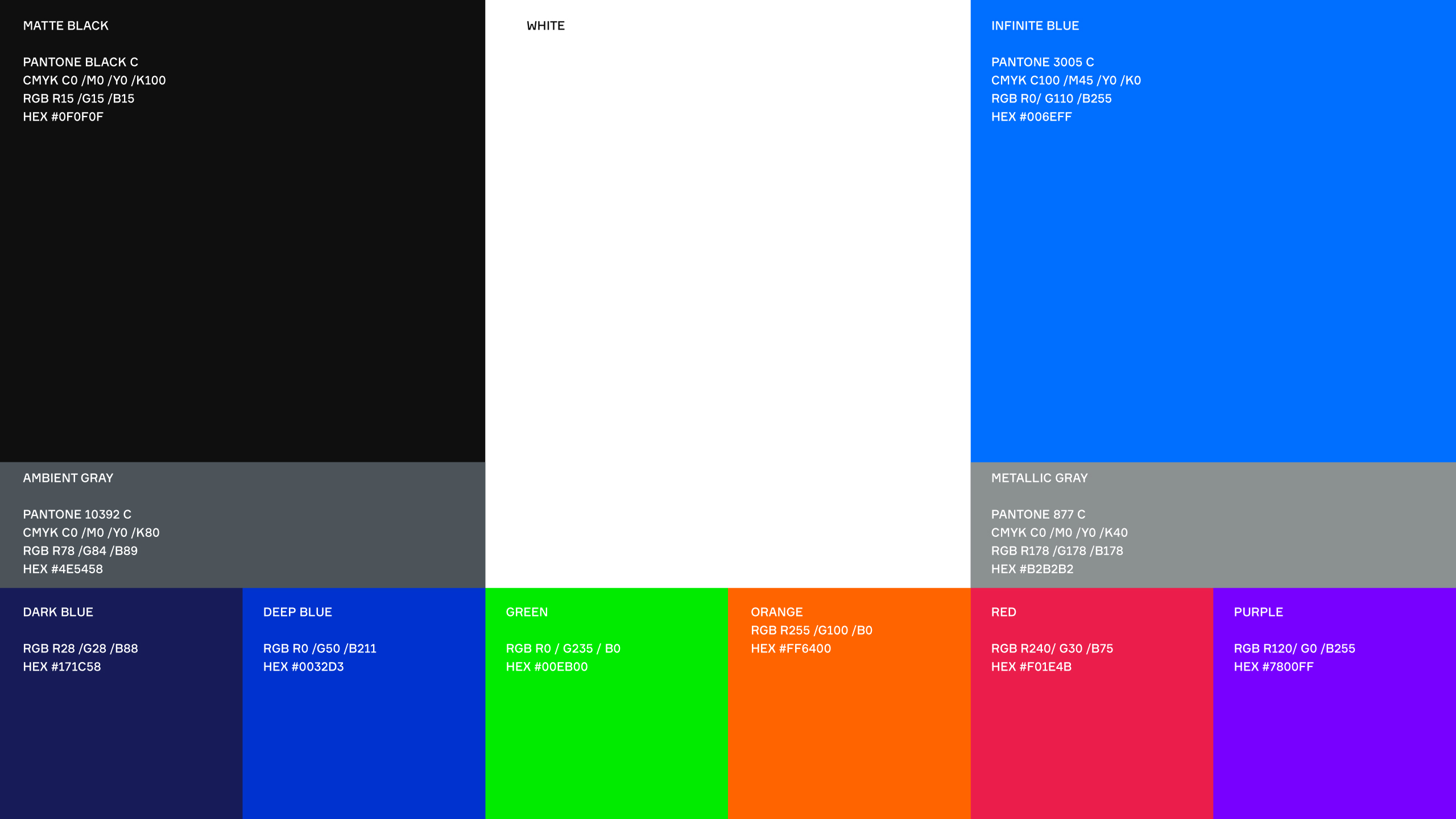
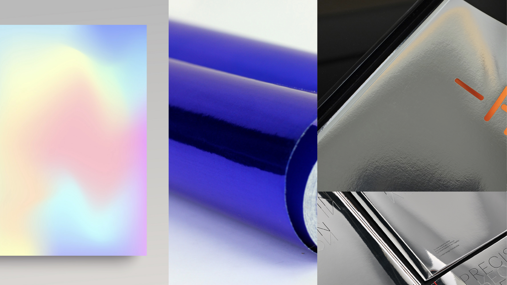
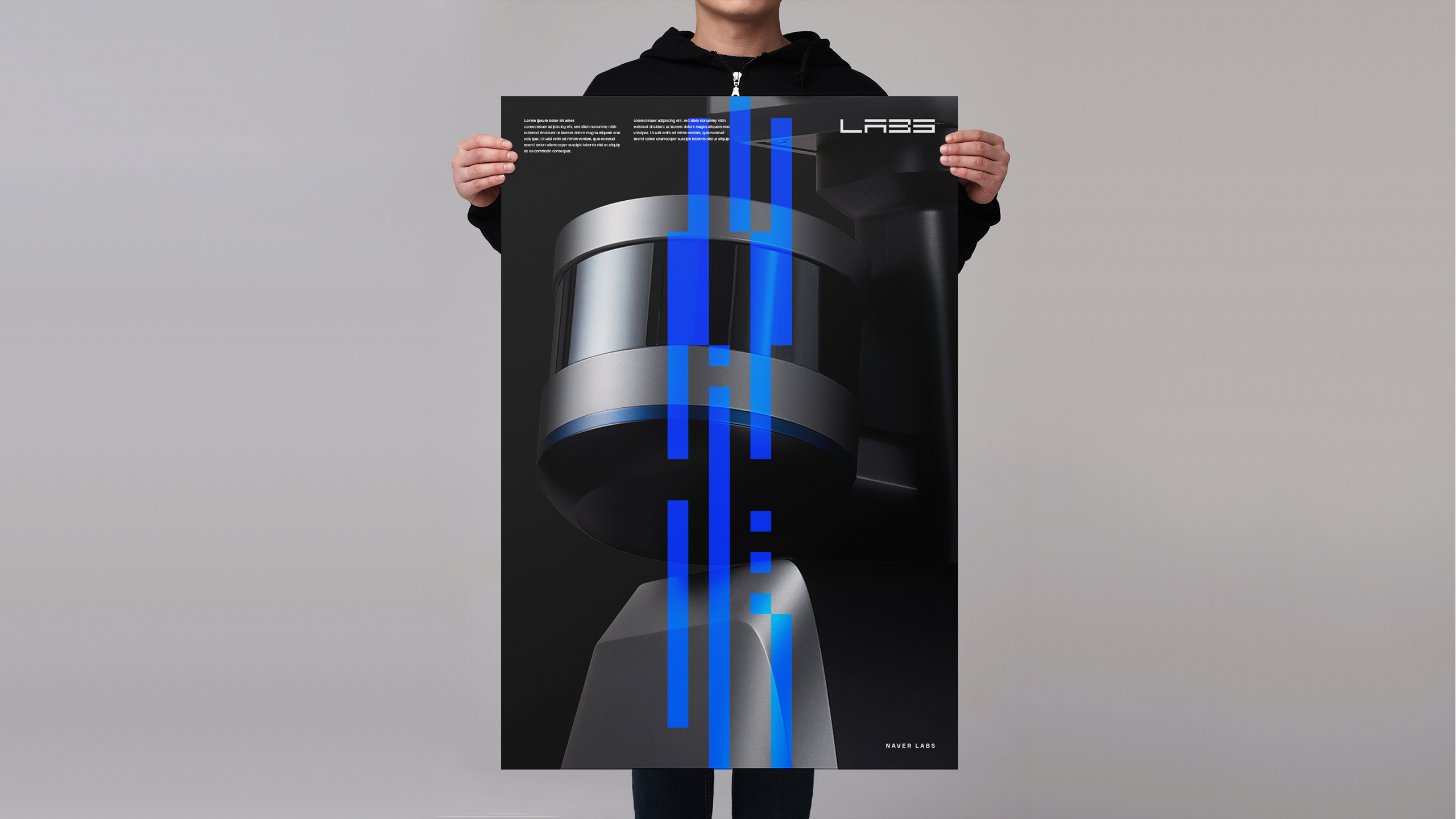
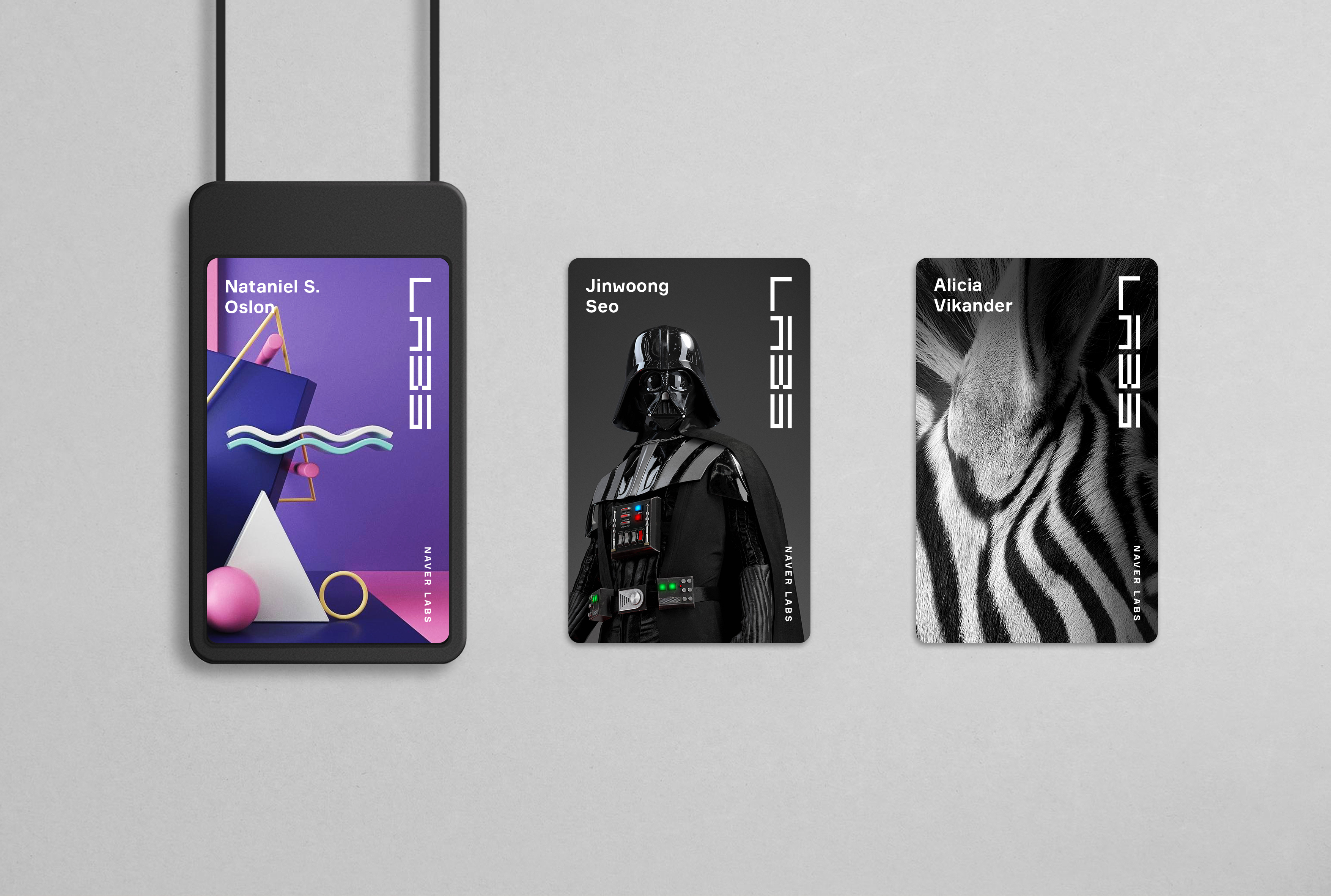
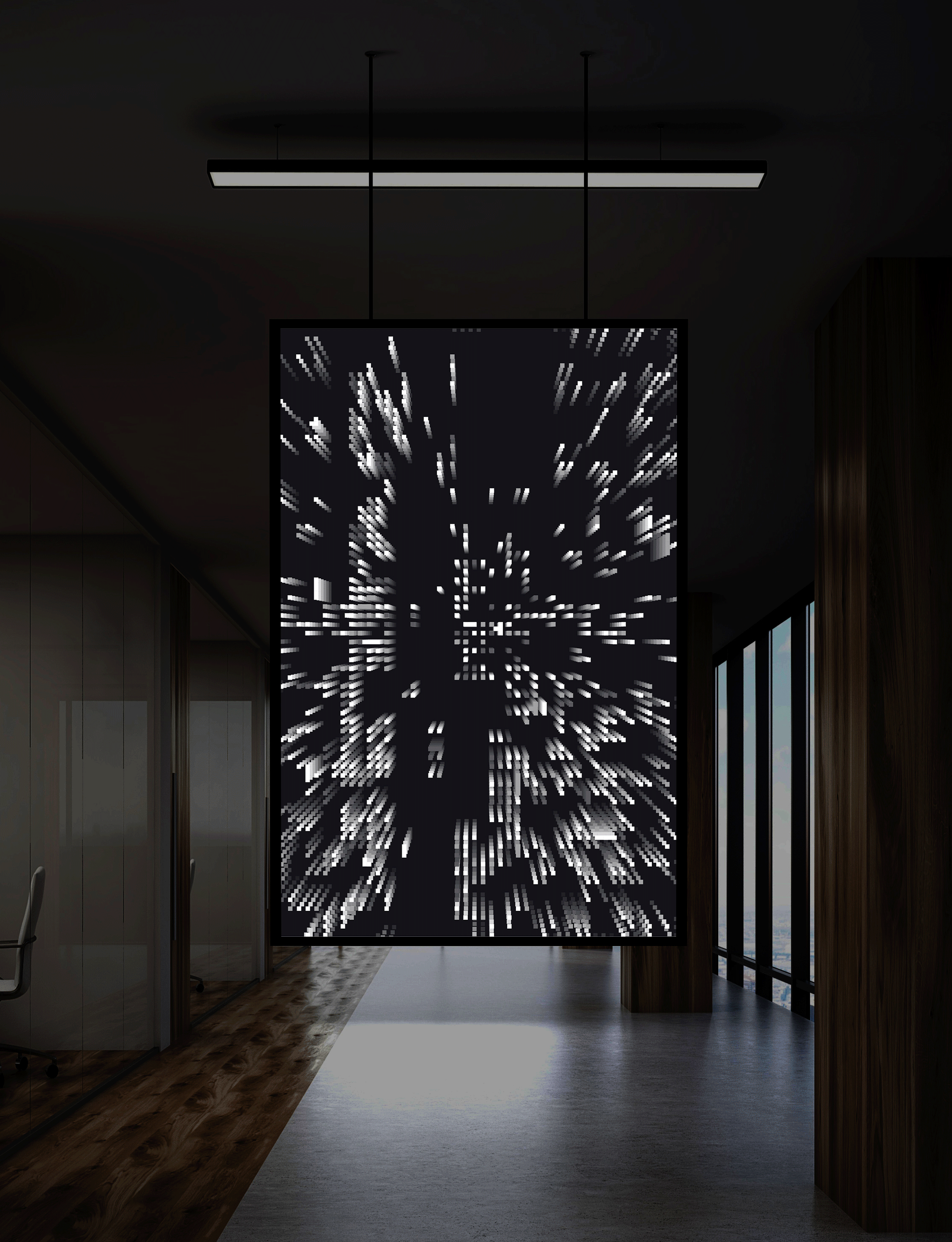
Monochromatic color with interactive blue accent colours creates a more ambient intelligent atmosphere. These colours are on show throughout all aspects of the identity - across packaging, marketing collateral, website as well as Naver Labs' hardware.
The set of icons were designed with simple squares and dashes, aligned with the design language of the brand.
Monochromatic color with interactive blue accent colours creates a more ambient intelligent atmosphere. These colours are on show throughout all aspects of the identity - across packaging, marketing collateral, website as well as Naver Labs' hardware.