DeView
Developers Conference
September 2017
-
Branding
Identity Design
Brand Experience Design
DeView is the biggest developers conference in Korea, sharing knowledge, pursuing excellence, and making growth together. Since its first debut in 2008, DeView has been an excellent debut stage for developers to share meaningful insights and valuable opinions to build the future. The name, DeView, stands for 'Developers' View', and a debut stage for developers (DeView and debut are homophones)
Marking the 10th anniversary of its foundation in 2017, DeView committee planned to refresh its brand identity. I worked closely with them to redefine its brand and visual identity system as well as the tenth-anniversary design theme.
Marking the 10th anniversary of its foundation in 2017, DeView committee planned to refresh its brand identity. I worked closely with them to redefine its brand and visual identity system as well as the tenth-anniversary design theme.


Logo System
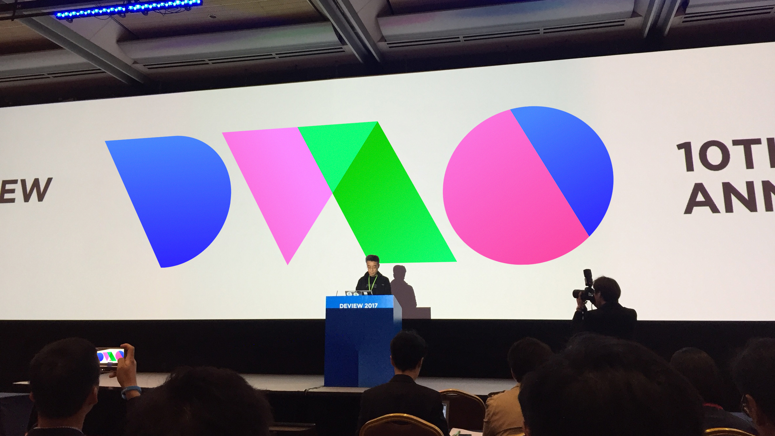
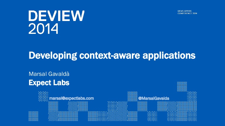
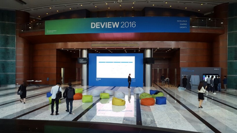
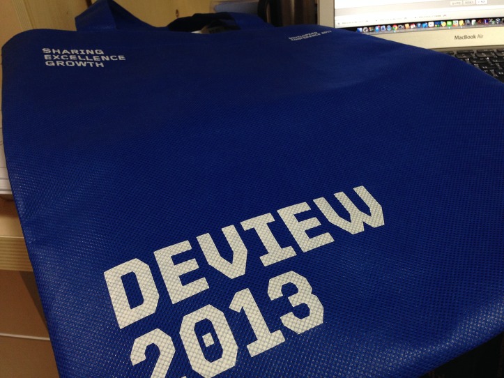
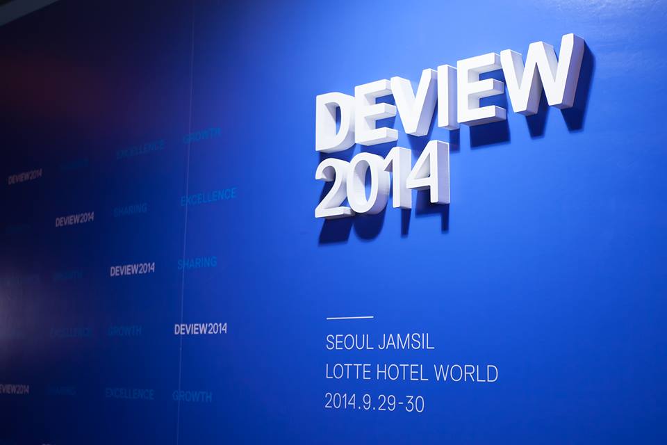
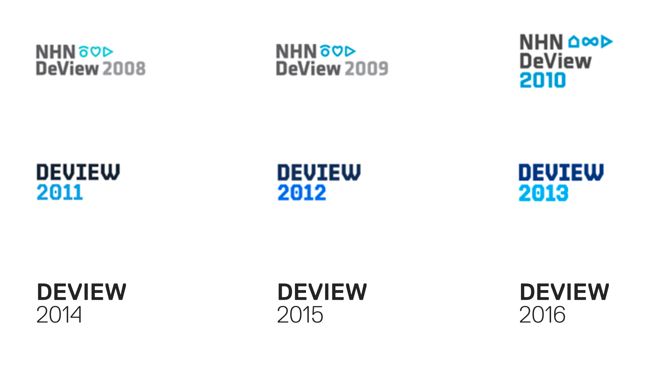
DeView has been changing its logo every three years. I believe that changing the logo often is not a good idea to build a consistent brand image. However 10th anniversary could be a turning point for the brand in every aspect. The logo has to have flexibility and adaptability to every environment from print to mobile and digital.
The new logo is simply typed but has a flexible system to fit into any environment. Especially on mobile, the logo can be shrunk into a monogram to fit in small space such as favicon.

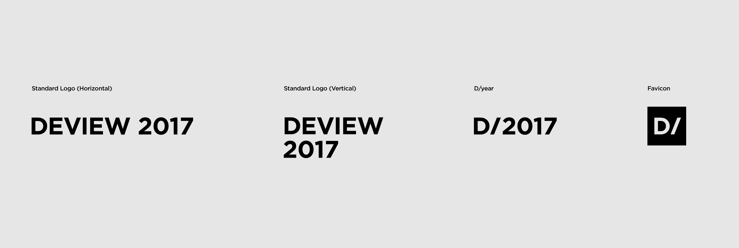
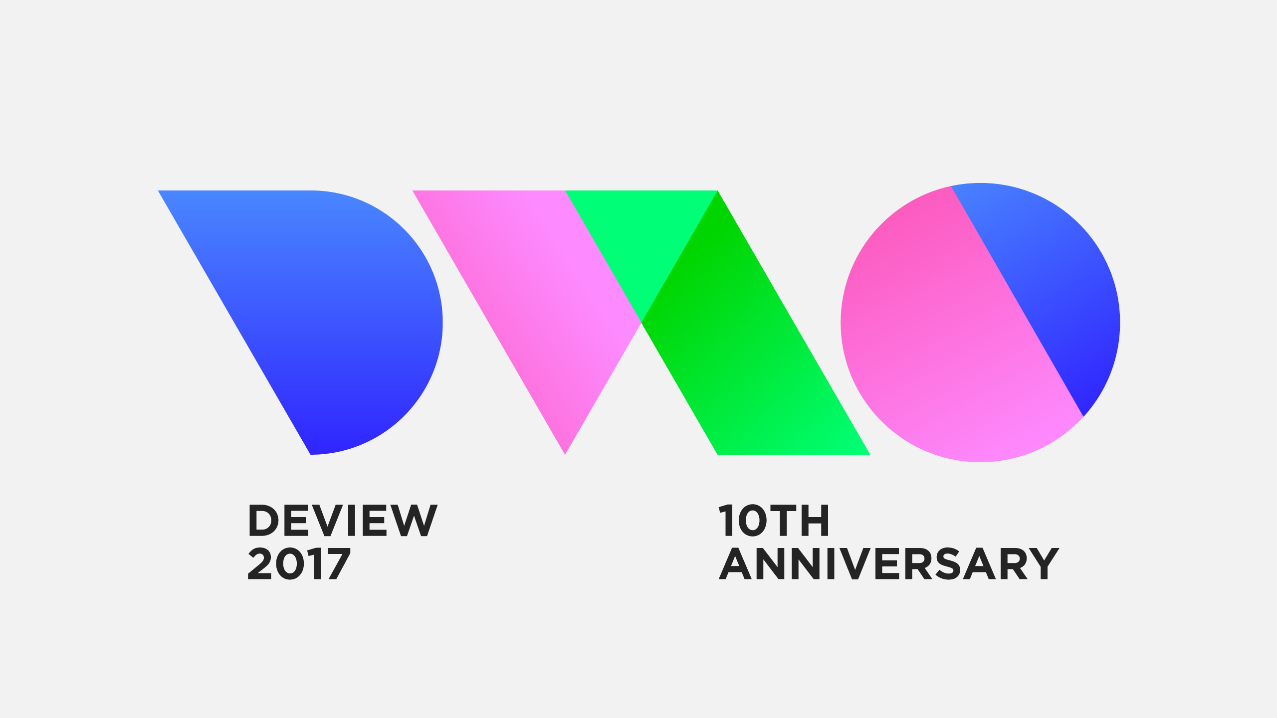
10th anniversary logo
with slogan
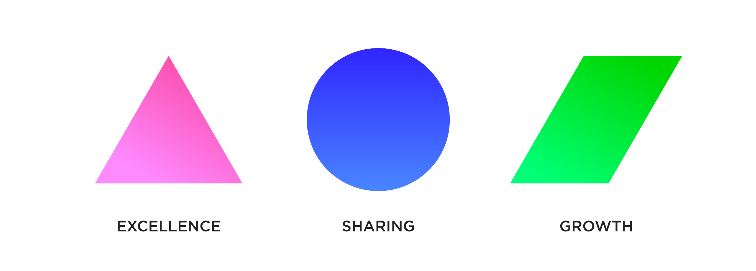
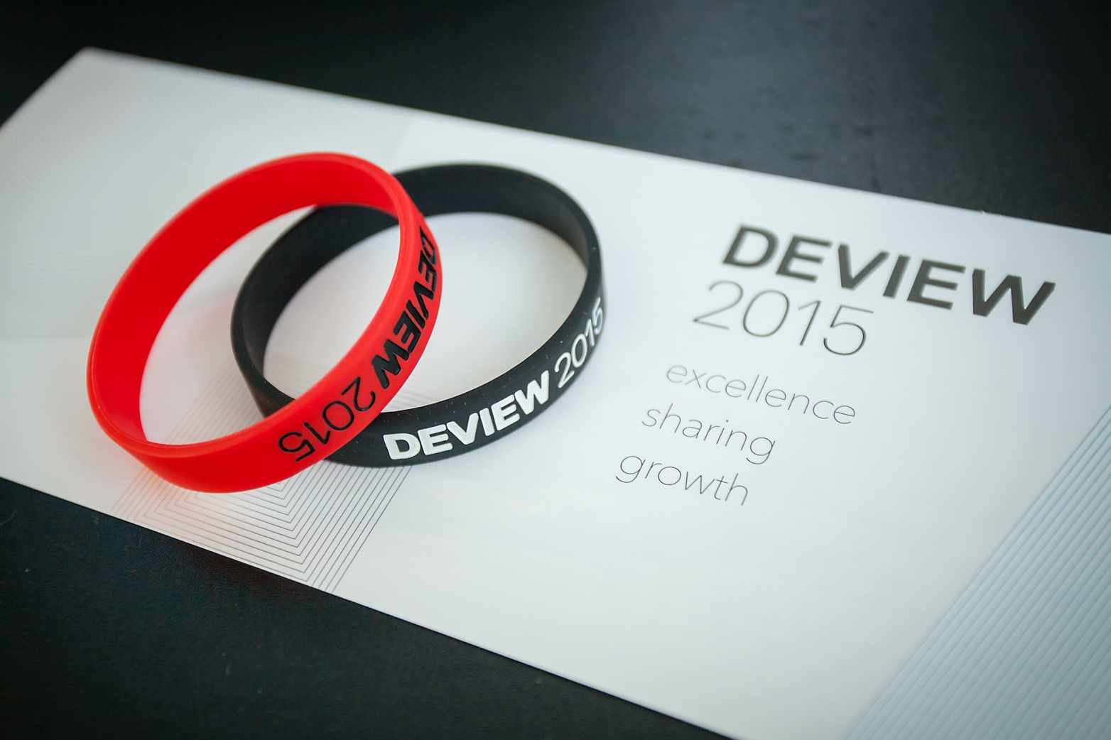
DeView has been pursuing: Excellence, Sharing, and Growth for its audience. Those three values have remained for a decade while the DeView logos have been changed for 3 times. They are true representatives for DeView brand philosophy. Those mindset are symbolised into graphic elements.
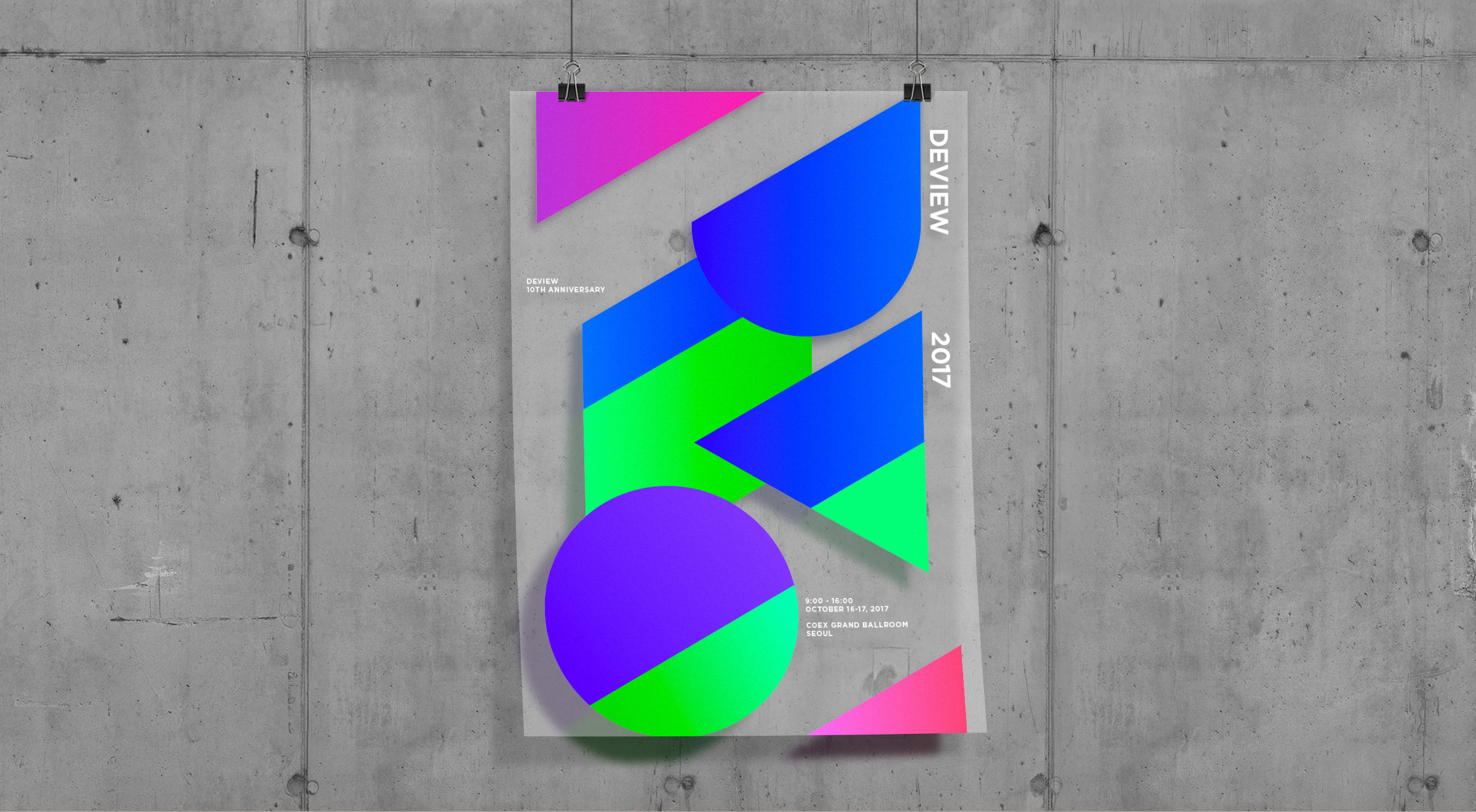
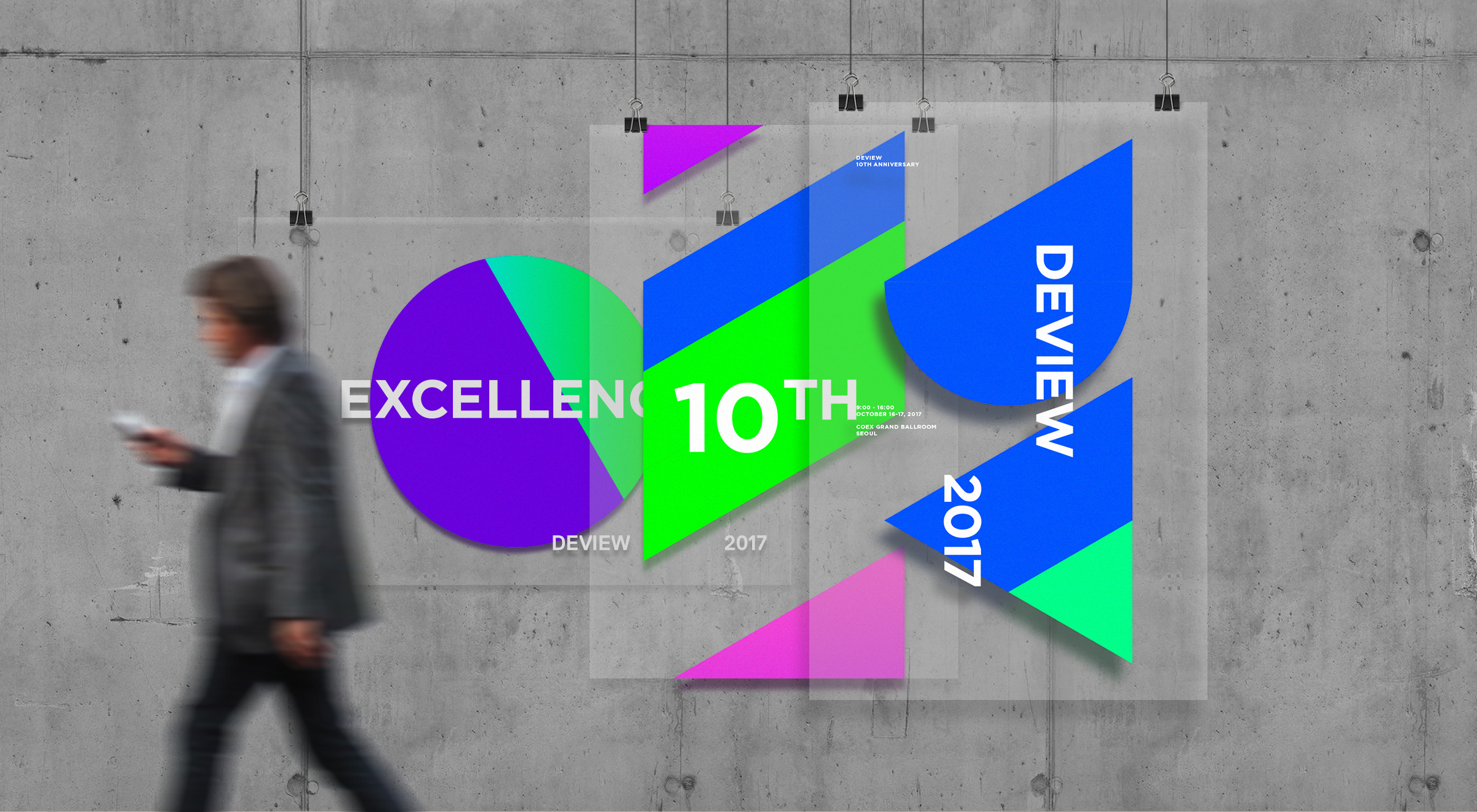
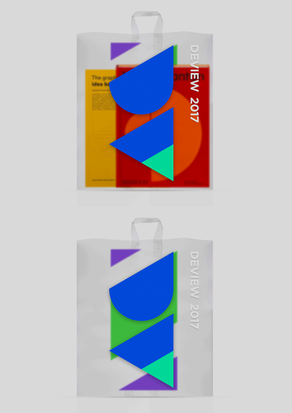
We believe that future can be buit by layering different ideas and thoughts from all developers. layering those graphic elements actually can create whole new picture for the better future. Elements create new shapes by layering each other from what they were in the first place.
