CJ Korea Express
2015Plus X
Shin Myungsup
Seo Jinwoong, Lee Hyojin, Kim Yura
Im Taesu, Kim Minkyung
CJ Group Marketing Office
Yang Hyoseok, Kim Taehyun, Kim Leah
CJ KX PR Team
Lee Dongsoo, Kim Eunkyung
CJ O Shopping Fashion Business Team
Kim Kyoungdeok, Hwang Jaewoong
Established in 1930, Korea Express was the biggest logistics in South Korea. By incorporating into CJ group in 2011, they needed to change their name to CJ KX and the entire brand looks in accordance with CJ group identity guidelines while keeping their core value that actually defines who they are.
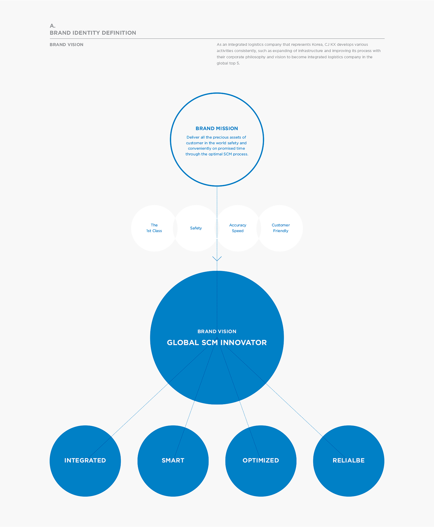
Plus X team consulted with CJ KX to define themselves as the Global Logistics Innovator, looking at their historical achievement in logistics.
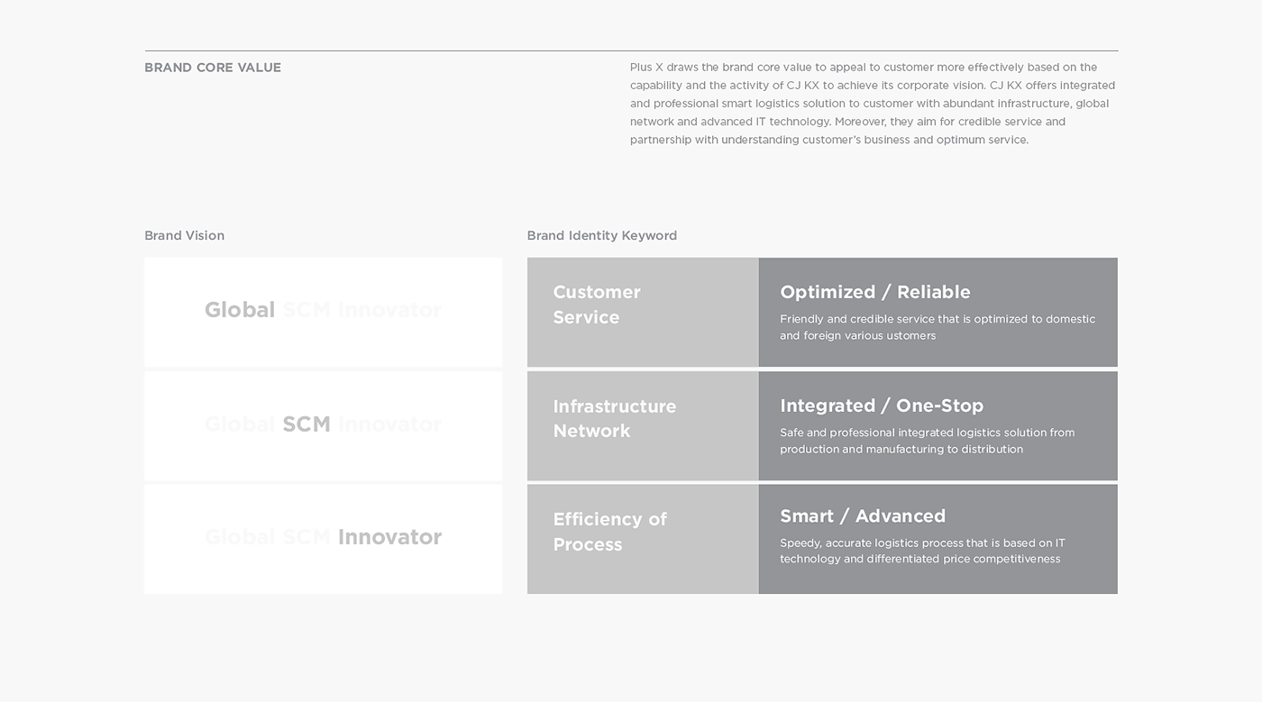
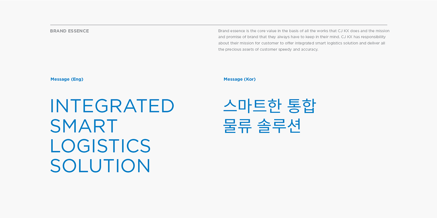
With more than 90 years of logistics know-how, abundant infrastructure, global network, and advanced IT technology, CJ KX exists to help other businesses grow by solving logistics problems, that is the brand core value that captures its smart, integrated, optimized, and credible logistic solutions.
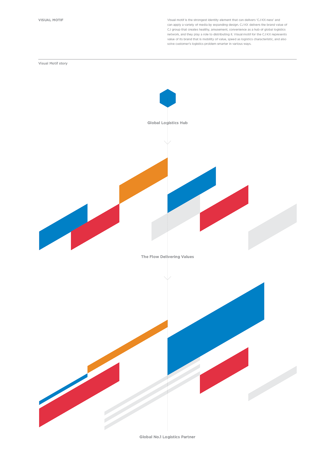
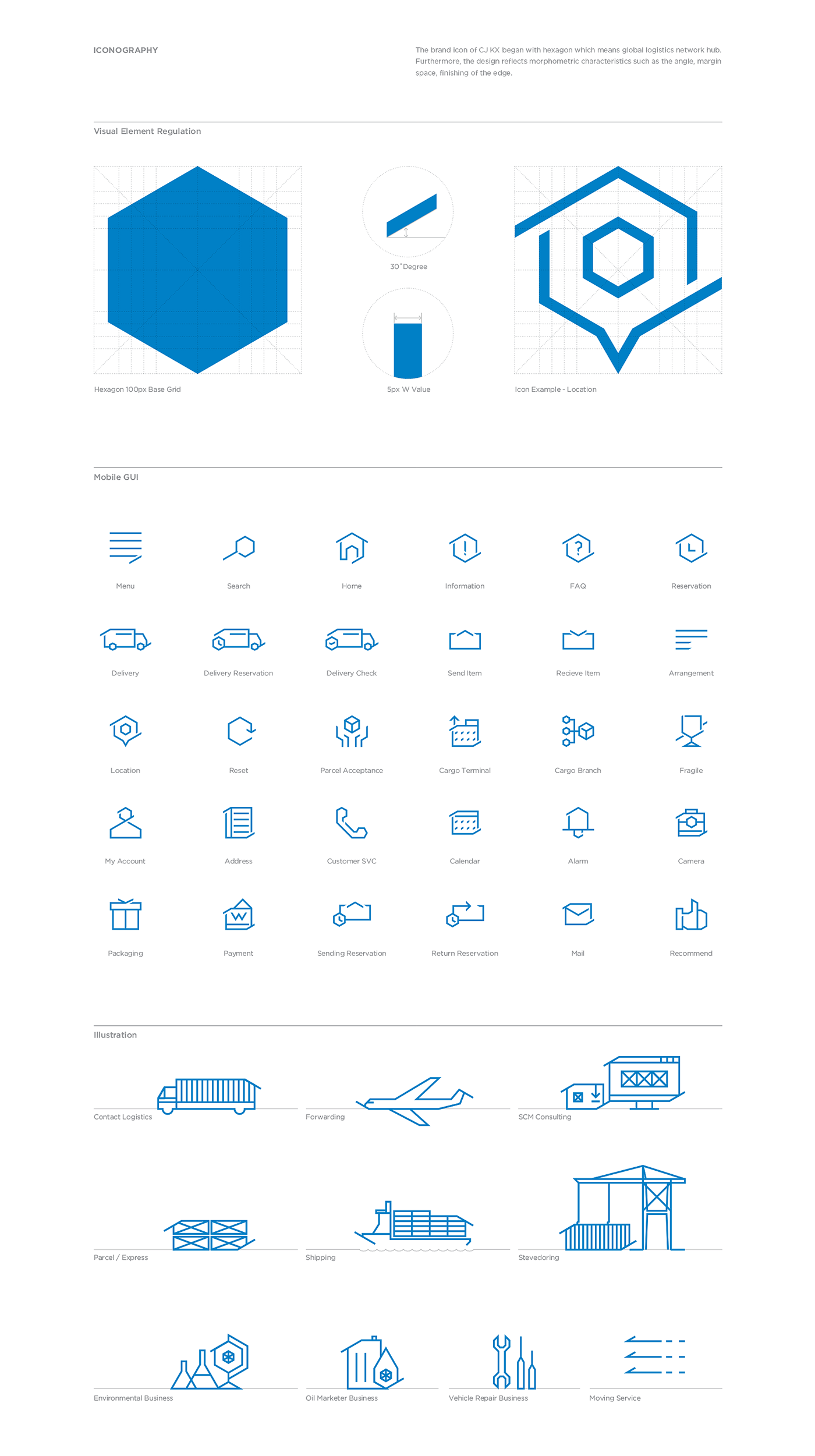
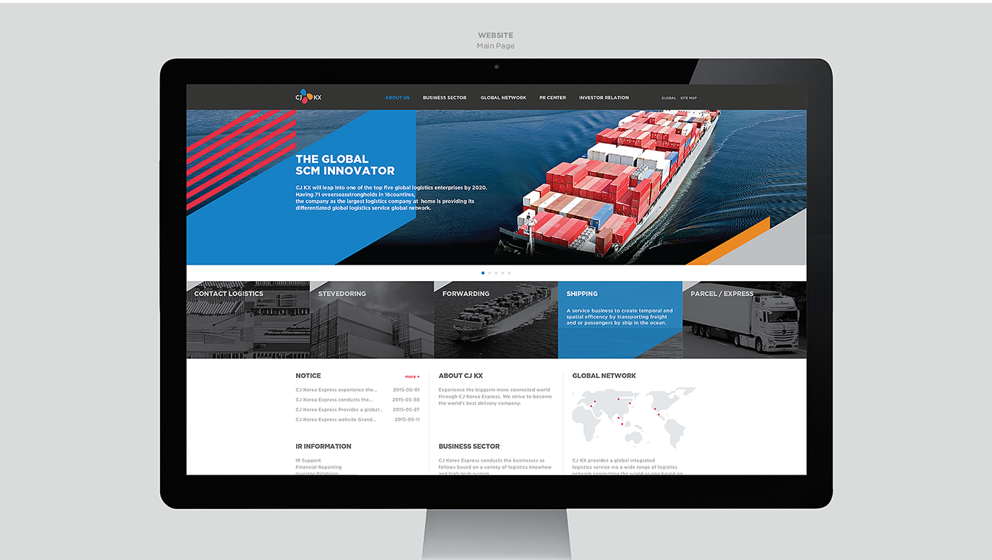
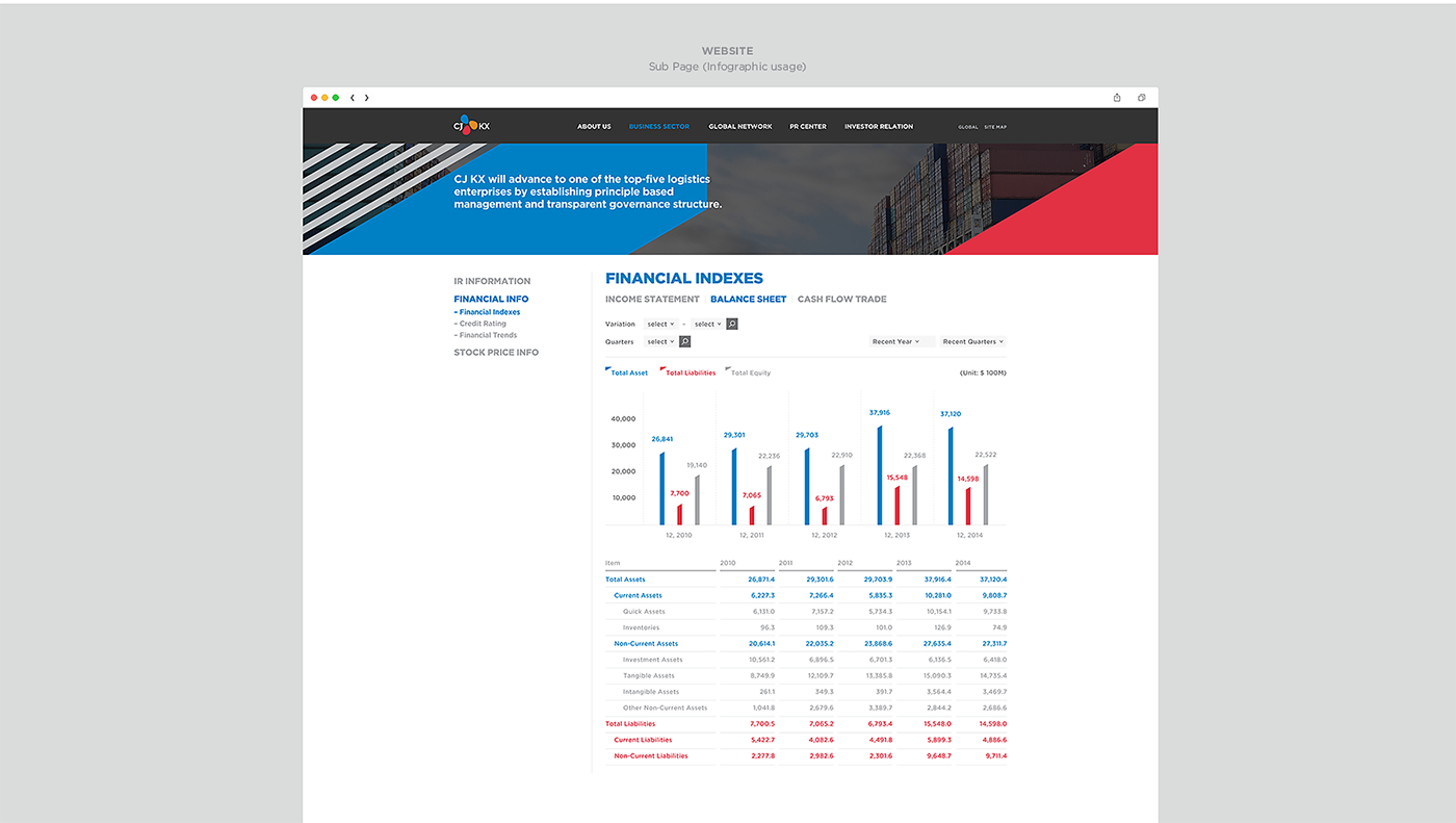
The new brand identity not only reflects CJ Group's brand identity but also keeps its originality and heritage. Plus X designers adapted CJ group brand colors that give intimate and vibrant brand image and visualized its distinctive logistics know-how, smart flow, that solve logistics problems for a business. The hexagon grid system that represents the brand’s precise, integrated, and speedy logistics solution plays a central role in embracing consistency and expandability of the brand identity.
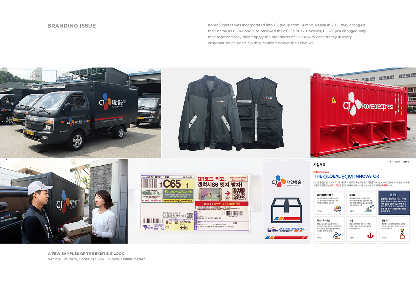
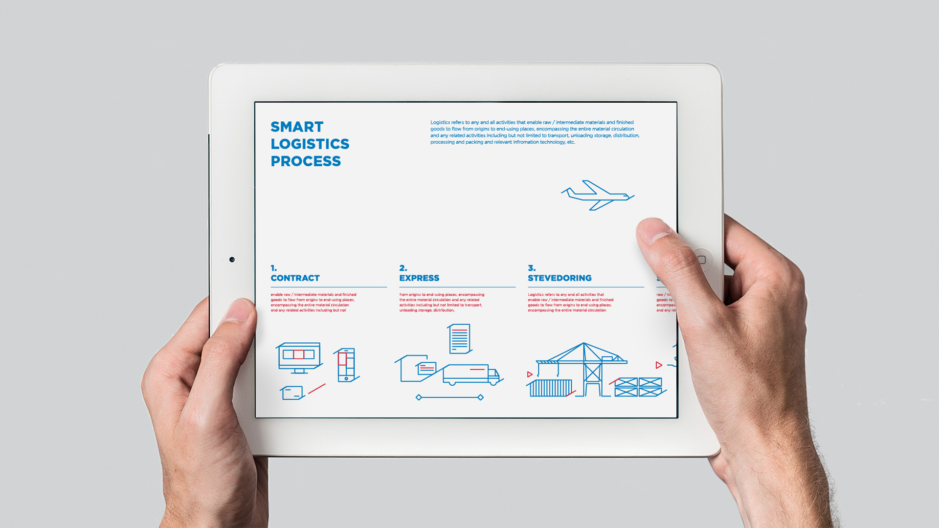
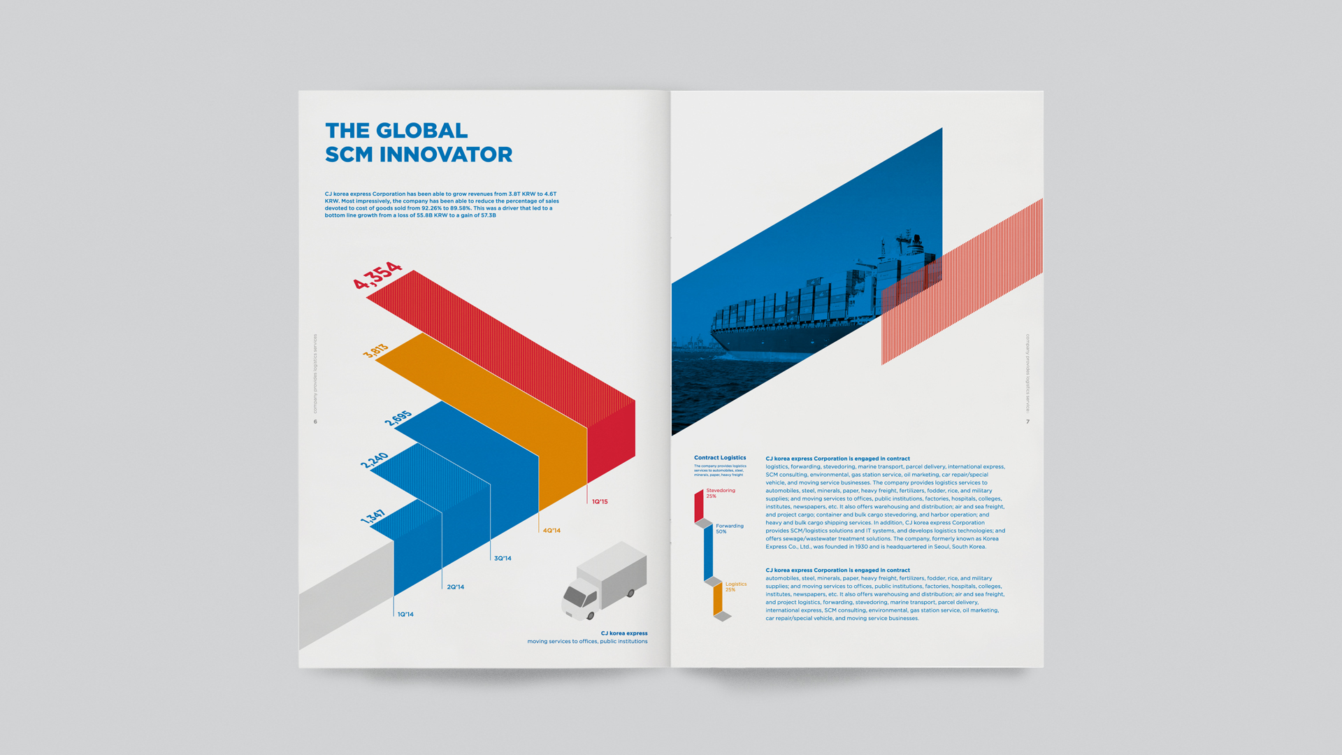
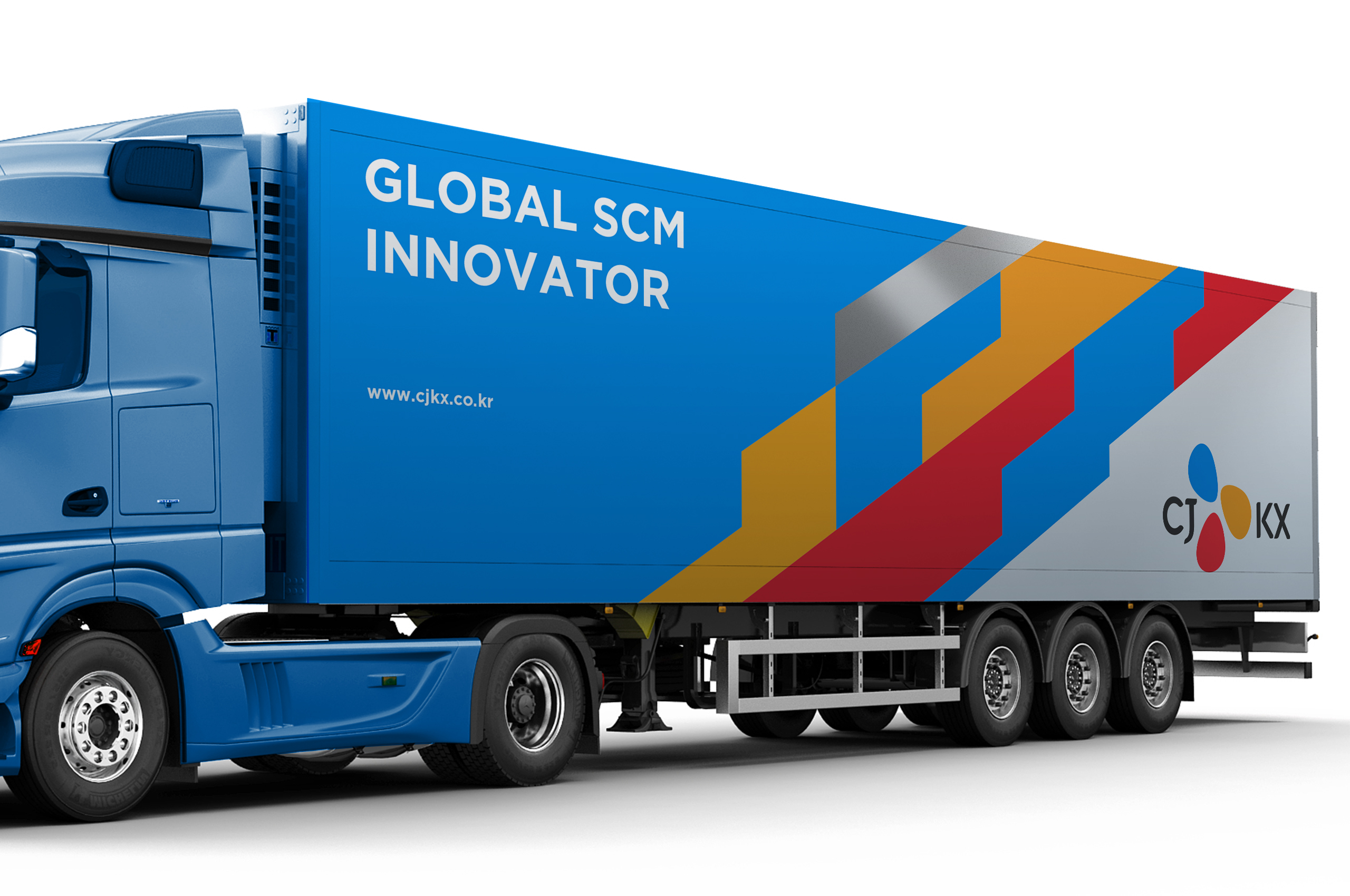
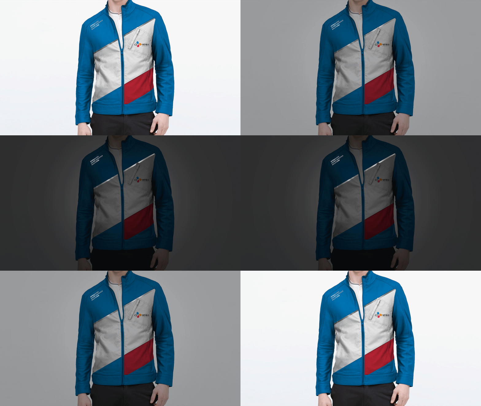
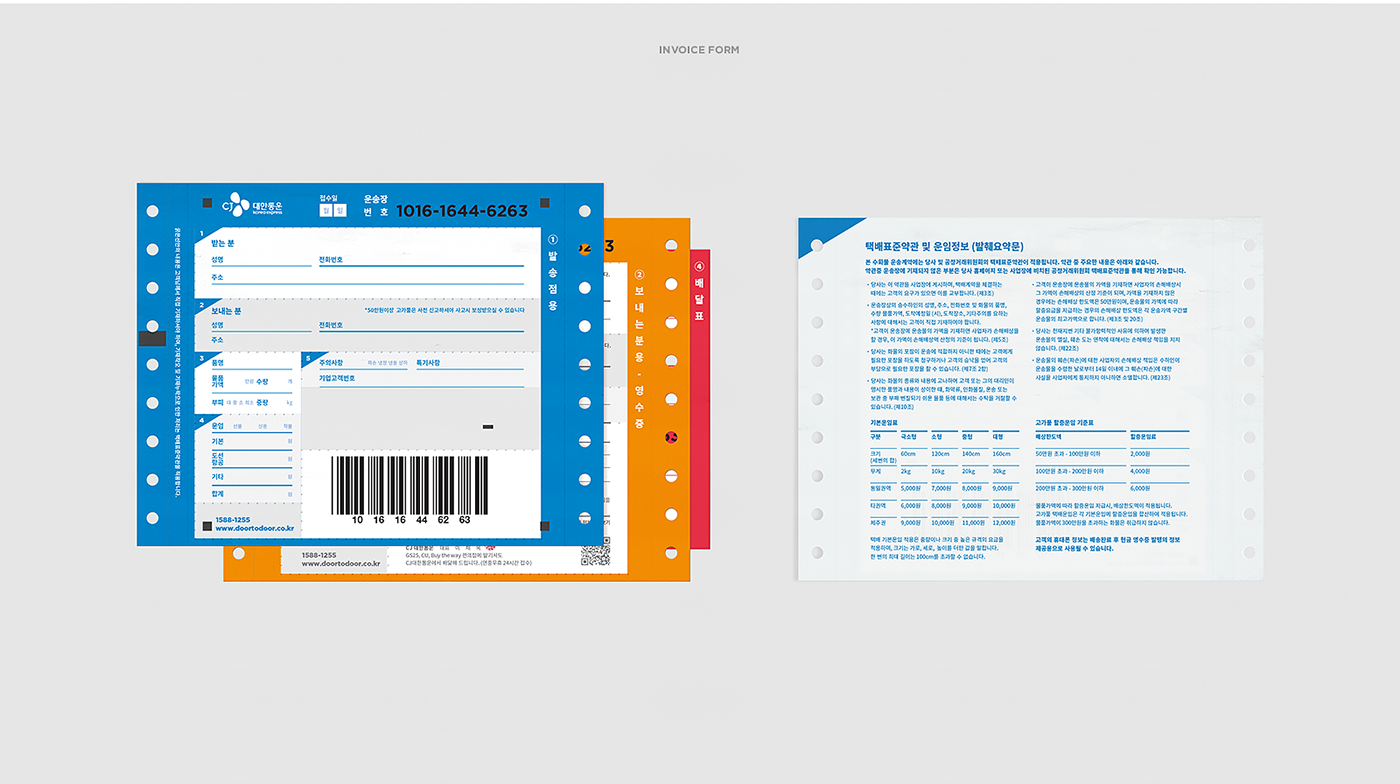
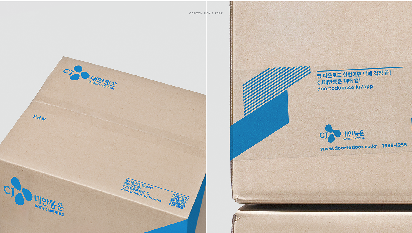
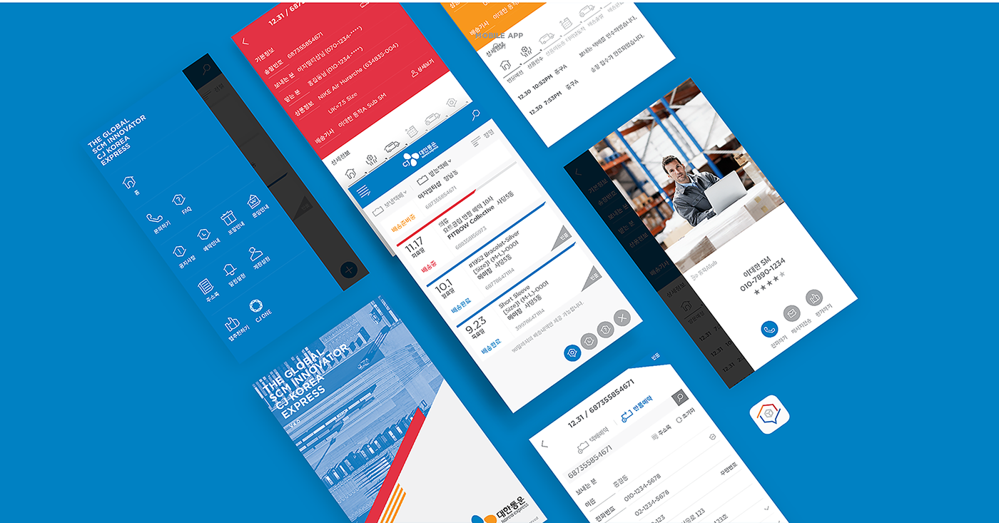
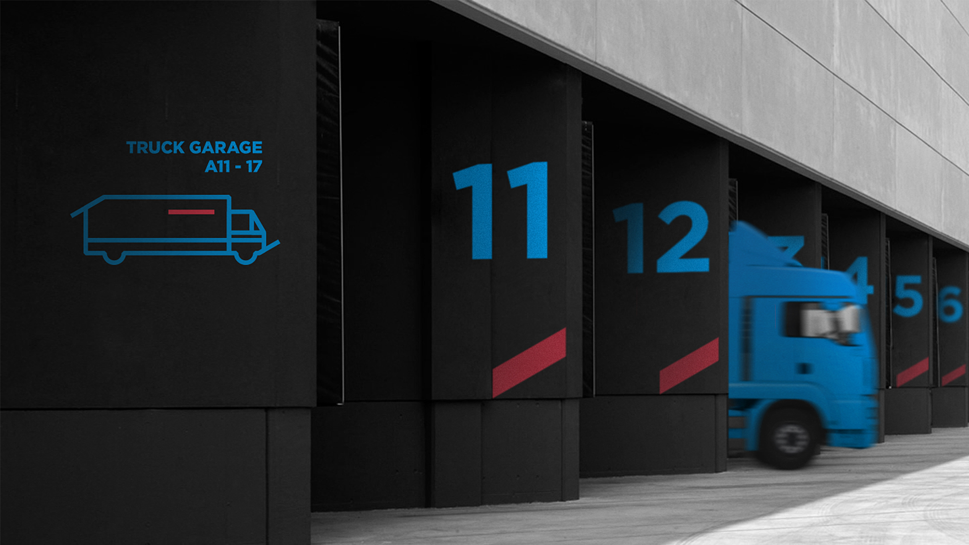
Plus X carefully crafted design applications considering brand experience for both customers and service providers. For instance, parcel boxes, invoices, and digital apps are designed in a simple layout and noticeable colors for customers to understand what information is important. Uniforms and vehicles that used to be in dark gray, now have a bright and strong blue color with sub colors, that not only increase the safety for drivers and delivery men to be easily recognized during night time but also deliver a bright and positive brand image to the customer.

