Baum Esthetic & Spa
Branding, identity design system,
brand experience design
2013
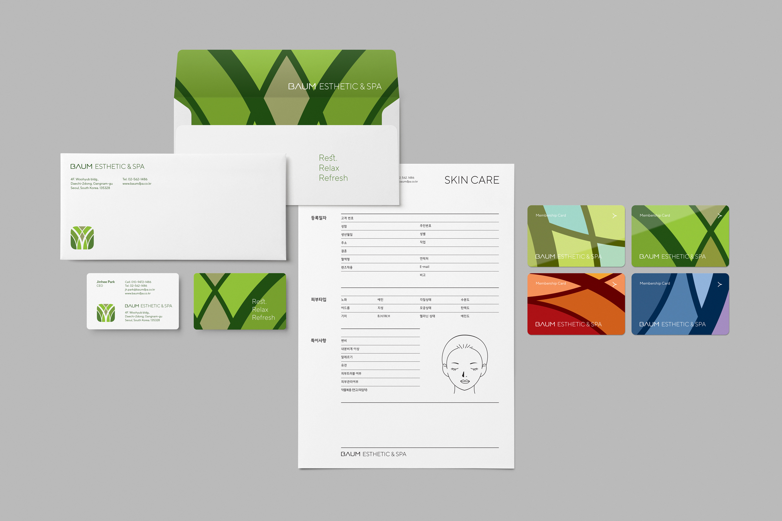
Baum is a spa brand in South Korea. They are known for its famous four unique therapies. I developed a brand identity framework for Baum that highlights its unique therapies and CEO's philosophy. The project encompasses everything from naming, brand positioning, and messaging, packaging, to space design.
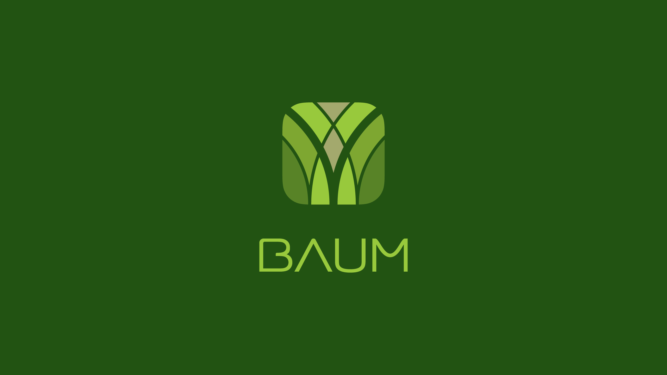
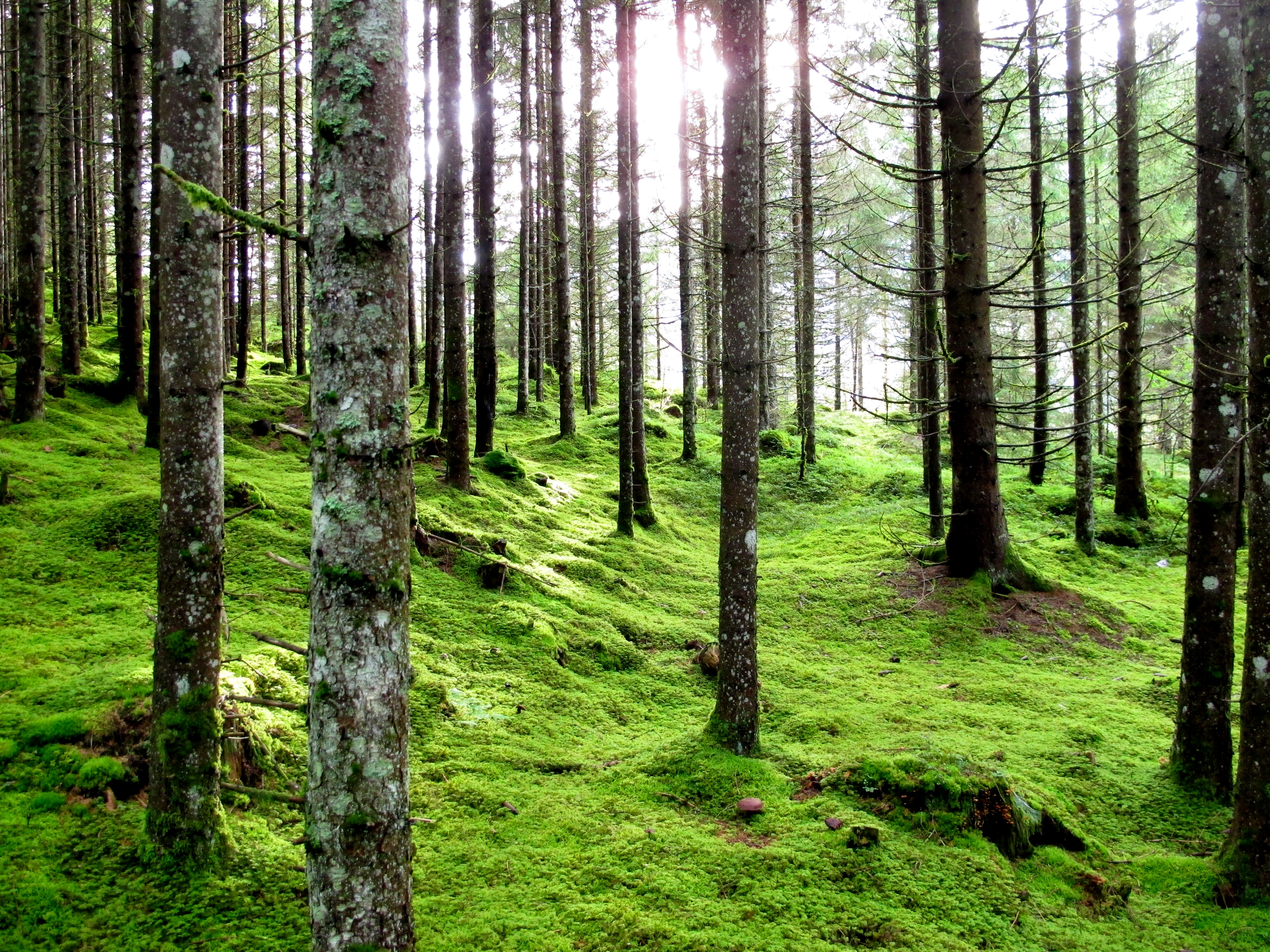
Baum aims to bring people who are exhausted hectic urban life an absolute relaxing experience as if they rest in the forest. Baum, meaning 'tree' in German, was one of the candidates for the brand name. Baum perfectely matchs the brand philosophy, an absolute relaxing under the tree.
The brand identity centres on tree motif, symbolising layered trees in the deep and rich forest. Inspired by the seasonal change, the logo changes its color-matched with each season. And the color palette is also inspired by nature which creates a relaxing and calm sense of atmosphere.
The wordmark appearing in a huge and empty inner space with natural curves. It delivers a sense of comfort and message that "empty yourself".
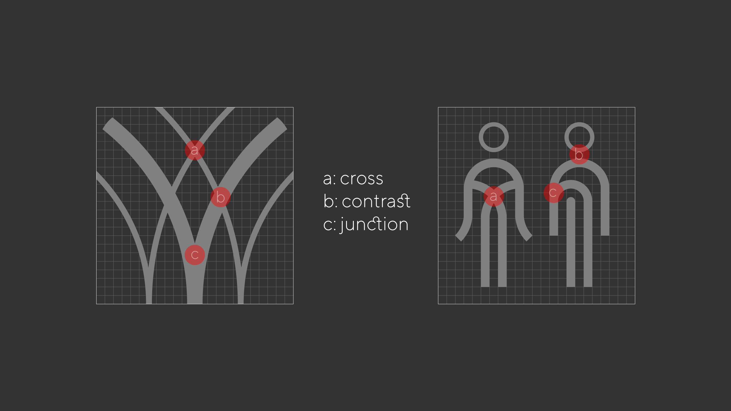
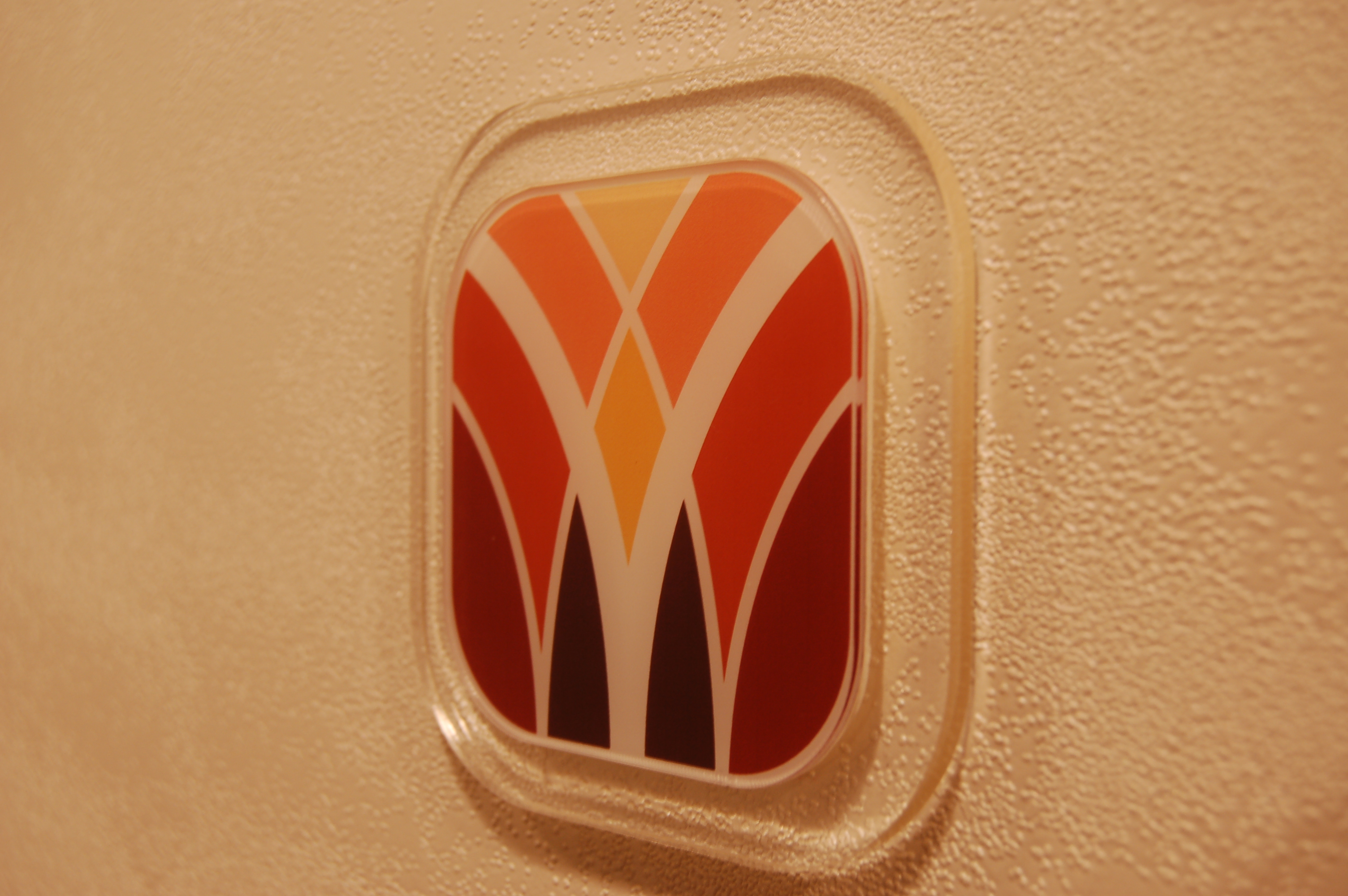
Baum offers four different types of unique therapy (cold, hot, refresh, and rich) to meet different customer's needs. I matched this distinctive service with four seasons of nature.
Nature changes its color, temperature, and even atmosphere as season changes. Spring is well-matched with the refresh service, and summer for hot therapy which goes with steam massage, autumn for rich, and finally winter for cold therapy.
The icons are accompanied by the same line contrast and unique characters the symbol has.